Friday, 30 December 2016

STORYBOARDING x2


Evaluation of film poster and Storyboard
My film is titled ‘The Awaiter’ and adopts the genre and key conventions of a horror movie. I think the idea of my film is conventional because even the title alone creates tension and the genre will entice viewers with stereotypical advertising. From my poster, the genre of the film is exploited because of its dingy dull colourings, the reds connoting blood and pain and the almost distorted and un-revealed main image shows something is almost hiding or ‘Awaiting’ as indicated by the title. Also the genre is shown through the film poster with mentions of other horrors by the same director such as SAW and the inclusion of imagery of actors appearing in the horror series ‘American Horror Story’ and ‘SAW’. With the inclusion of the hands in my poster it almost connotes a restraint or something grabbing the audience into the poster. the black colourings connotes mystery and darkness and negativity as well as shadowing-almost suggesting something could be ‘awaiting’ in the shadows..Linking to the title. The rhetorical question ‘who’s waiting for you?’ almost gets the audience involved with the film and once again links waiting with the title of awaiting. The ellipsis before the question also connotes a pause therefore empathising this idea of waiting. The old newspaper clipping I purposely included in my trailer connotes a more old/eerie basis and story. From my trailer, you can tell what the genre of the film is because it revolves around very dark scenes and camera angles that appear to be almost hidden or at daunting angles that appear like the main actor is being watched.  The variation of camera angles, such as a close up shot of a clock and the slowly paced camera movement as we see footsteps in scene 10 in contrast with the long shots and the jogged and blurred shots so that different parts of the film are addressed in different ways.  The close up shot of the clock connotes time and once again ‘awaiting. The red in the trailer for the twisted pictures logo and actual film title empathises this in contrast with the dark colours of the trailer, but also connotes pain, possibly death, blood and fear. As well as the colours, the actual noises of the trailer with diegetic and non-diegetic sound create a trailer that makes the audience question where the noise is coming from. Jump scares also support the horror genre because they almost make the audience feel involved and scared. The twister pictures logo is the first thing to appear in my trailer, supporting the horror genre as this is a common film company that produces horror movies that the audience will be aware of. ‘Ghastly echoes’ as sounds will create the horror movie feel to be exaggerated through visual and sound.   Crafting the music I would use to reach points of crescendo makes it more frightening, and the diegetic sound links to non-diegetic sound so that narration such as ‘ prepare yourself’ is supported with a scary song playing in the background gaining volume.
My target audience is both genders, with an age range of over 15 as this allows me to explore some more mature and daunting themes. My film would appeal to this audience as from some brief research- the idea of going to the cinema to watch a horror movie comes across as an adventurous chilling idea that many teens and young adults are interested in. also, by maybe including a subordinate plot that includes a love interest or some more criminal male themes both audience stereotyped favoured genders will be met.
Recently, similar films to mine have been popular with this target audience such as recent box office hits like Annabelle, Ouija and The Woman in Black Two. These films have been popular because the young adult and teenager audience are intrigued by the idea of being scared, and made to jump….this almost creates a more mature persona for audience members and also gets the audience completely involved with the film and the film can be relatable to common daily routine and things people are scared of.
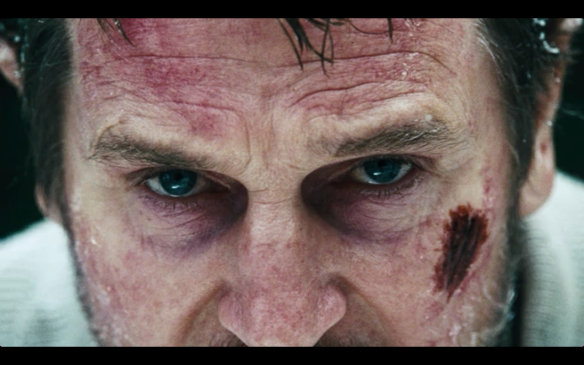
In my film poster I have positioned the darkened face of ‘the Awaiter’ in the top right hand sector of the poster which is stereotypical for most horror movie posters as it almost portrays the main persona of the magazine is almost hiding or over-shadowed. I have positioned the film title directly in the middle of the poster to show its importance and created my own font for the title as a unique selling point and its boldness and creativity will entice the audience in.  I have placed the hands in the poster directly above the credits and release date to almost grab the audience and lure them towards the release date so that they watch the film.  I have differed from stereotypical horror movie posters by actually revealing the actors who are usually not addressed in the posters but this makes the film seem like it has a additional thriller plot and that as typical of usual horror movies, the main characters do not always die. However, my trailer adopts similar features of other horror movie trailers because it uses the idea of once short scene included in the trailer rather than a combination of revealing events. Because there is almost a sub-storyline portrayed in the trailer the audience will carry on watching and are left with a sense of mystery.
In my work, I could have differed the amount of information I included on my poster to create more tension and have a primary focus of just ‘The Awaiter’. I also could have made the date of release more exact for an audience to receive the information in a more convenient way, and I additionally could have brought more attention to the rhetorical question that is directly addressing the audience.
Throughout the creation of my poster and trailer I have applied the way I used different techniques to both the uses and gratification theory and the ‘hypodermic needle theory’. I attempted to convey the audience into a world where chilling creatures and supernatural occurrences exist… however by doing this I also entertained and got an audience to feel mixed emotions…and allowed escapism from their everyday troubles.


Thursday, 15 December 2016

STORYBOARD 1


This is our storyboard that we created using our initial ideas; however this was not our final idea as evident in our actual film. These drawing show a few of the shots that we do actually use in our trailer, for example, the close up shot of the hand and the point of view/reflection shot in the mirror... both of which are effective shots, through the alteration between different views and angles.The drawings were very sketched as shown and these were done in rough until we fully decided on what we were going to do. Following on from this storyboard will be our animatic which is simply our story board edited into an animated film; to create this we will be using the Adobe Premier Elements software, or we are potentially considering using movie maker as the creation of the animatic is quite a simple process of collecting the images/short clips of our storyboard together and adding minimal sound.

Wednesday, 14 December 2016

Relevant online tutorials #2


https://www.youtube.com/watch?v=p75U7edXmMM

This online tutorial was useful to watch to get a general introduction to the software, despite using it last year to edit our opening two minutes... it was useful to reinforce all of the techniques and features that we are able to use on the software. The clip above is just a general guideline for beginners and first time users of the software... however it was beneficial to just be reminded of the basic uses.


https://www.youtube.com/watch?v=Lywtcq4SZQM


This tutorial is a guide to adding sound to your movie/trailer. This was useful for us, particularly because the majority of our sound is going to be added as the sounds in our filming were not as clear and as good quality as we hoped. This clip shows us how to add music, delete audio, scale and add media into our own clip. After watching this, we are now much more confident in adding and editing sound into our clip which is making the editing process a lot easier.


https://www.youtube.com/watch?v=_odzhE3RFGI

This tutorial was another basic yet useful clip to watch which involved the creation of titles. This involved getting the title background; which is actually through using the paint software, and also the general features of adding and editing the title. So, chagning the font, the size and the colour. The tutorial also shows how you can add credits to your movie/trailer which is quite a simple process and easy to follow. Also, we learnt from the clip that you can also add transitions to the titles which would involve them fading in or out, etc.

Tuesday, 13 December 2016

Relevant Online Tutorials and Comment


 https://www.youtube.com/watch?v=p75U7edXmMM

This online tutorial was useful to watch to get a general introduction to the software, despite using it last year to edit our opening two minutes... it was useful to reinforce all of the techniques and features that we are able to use on the software. The clip above is just a general guideline for beginners and first time users of the software... however it was beneficial to just be reminded of the basic uses.  


 https://www.youtube.com/watch?v=Lywtcq4SZQM

This tutorial is a guide to adding sound to your movie/trailer. This was useful for us, particularly because the majority of our sound is going to be added as the sounds in our filming were not as clear and as good quality as we hoped. This clip shows us how to add music, delete audio, scale and add media into our own clip. After watching this, we are now much more confident in adding and editing sound into our clip which is making the editing process a lot easier.  


https://www.youtube.com/watch?v=_odzhE3RFGI

 This tutorial was another basic yet useful clip to watch which involved the creation of titles. This involved getting the title background; which is actually through using the paint software, and also the general features of adding and editing the title. So, chagning the font, the size and the colour. The tutorial also shows how you can add credits to your movie/trailer which is quite a simple process and easy to follow. Also, we learnt from the clip that you can also add transitions to the titles which would involve them fading in or out, etc.

Friday, 9 December 2016

Mood board

Pictured above is a mood board we created of all of our initial ideas, some of which are developed and enhanced from our AS film opening study, and others which are new ideas and filming methods we would wish to experiment with. some of our earliest ideas for themes are depicted above, incorporating generic collocations of horror with these dark images, and lack of escapism with the pictures of confined spaces and rooms, and reflective imagery shown with the mirrors. we wanted to incorporate general genre related features like slow moving, shadowy characters in homely environments. This would hence link to  media theorist Alistar Fowler who suggested audiences gradually through sub conscious familiarization learn what they end up expecting from particular genres of film such as horror. In our mood board with the photos we purposely picked we looked into imagery with different filters and type of lighting and editing, as we thought transitioning our movie trailer from color to black and white would create tension and show a ghostly transition from history and the past with harrowing happenings to the future, and also have already began thinking of how to create light so that we can film in dark rooms such as a bedroom without using warm natural lighting.

Wednesday, 7 December 2016

Further costume and prop research

When delving deeper into ageism and stereotypes of horror associated with age we found out in a poll of 30 15-25 year olds that the most feared age bracket was the young horror characters of film, of which individuals in our poll further went on to quote:
'that little girl in Anabel is the scariest'-anon 16
'i think orphan is the scariest film, but is the character in that a young antagonist or old? shes young at the start and old at the end'- jasmine 18

this study showed us that the audiences we are targeting out movie at fear young horror actors and characters the most, which led us to consider a plot reversal where the young character is the villainous,gothic character rather than the old lady. for this concept we experimented with white face makeup, and white hair chalk to intertwine feared features of old age such as wrinkles and the dull lifeless coloring's hair color and aged features with youth and innocence. in this way, by using a young antagonist character but with some of the features of the elderly, it intertwines all the features and ideologies that our poll respondents noted, and hence our film would appeal to a larger expansive audeince. The photo depicted above shows the young girl that we could use in this antagonistic role, however, we used the same child grudge like archetype in our AS movie opening and would hence enjoy experimenting with different representations and characters to make our movie trailer more distinctive.


Monday, 5 December 2016

Lighting research

One of our targets from last year was to try and use natural and artificial lighting more appropriately and professionally to enable aude
Three-point Lighting:

This is the most basic lighting set-up which consists of the...

  • Key Light - this is the main light used on the subject and it is also the brightest light source for the shot.
  • Fill Light - this is a softer light and the purpose of this light is to fill in the shadows created by the key light, preventing them from getting to dark, and lastly the 
  • Back Light - this is used to separate the subject from the background. It enhances the sense of depth in the shot. Back-lighting often creates a halo effect around the characters head, particularly the edges.

Low-key lighting:

The low-key lighting gives more of a shadowy effect. This shadow created by the low-key lighting would be most effective and conventional in horror films.]

Four-point lighting:

Four-point lighting is the same as three-point however with the addition of background lighting. The background lighting is used to illuminate the background area of a set.

Top lighting:

Top lighting is another common lighting technique; this is when the upper areas of the subject or character are lit (outlined) by the source generating above it.

Under lighting:

Under lighting is the approach of lighting a subject/character from a point below them. This partially creates a kind-of spooky effect.

Friday, 25 November 2016

Extra representation research- AGE

How are the elderly represented in media?
   Cultivation Theory coined by George Gerbner (1993) “mass media has impact on people and it is merely wholesalers of social roles in industrial societies. “They present a steady, repetitive, and compelling system of images and messages”.

After gender and ethnicity, age is the most obvious category under which we file people. Often age can withstand as a factor of television and film drama that allows a broader audience to view the drama.  By having a range of ages in a TV programme or film, there is a wider appeal. For example in EastEnders there is a huge array of ages so a very broad appeal…there is characters like Lauren Branning appealing to the rebellious teenage nature that many young teens and young adults adopt and then other, older characters like Dot Branning with her heavy religion and righteous, strong manner than can appeal to many older people alike. I think age of characters hints a lot about the intended audience…the majority of the characters in a drama like Hollyoaks for example are young, youthful adults and therefore it is targeted at a younger, fresher audience whereas a TV programme like the vicar of Dibley or Downtown Abbey reaches an older audience with the old-fashioned themes and subtle satire and comedy that only an older age range will understand. There is often a large emphasis in media towards youthfulness. There are many reasons why this is the case- and firstly because of the beauty youthfulness offers. Huge audiences can be drawn into a media creation merely by the appearance of it…so effective mise-en-scene with attractive youthful and new actors creates an automatic allure. Although my view is probably biased- I feel that females in particular enjoy having some form of attraction and youth in a programme… after all why would a girl watch batman if not for the expected young, attractive love interest teased in the trailer and film poster? Why would a girl watch fast and furious if not for the enduring physical attraction of Paul Walker and the expected plot b love path in the film? Why would a girl watch fast paced action drama Game of thrones if not for the young, enthralling presence of Jon snow? So, with all of these reasons to enjoy watching young, attractive and youthful actors...why are the elderly even included? I believe that the purpose of ageing actors creating a representation in TV and film is predominantly to create a contrast. A contrast between the young and the elderly, the old and the new, the modern and the historical. Without the elderly- TV and film have almost no context, no fictional history, no background. Comparing the young and the old is an important contrast relevant to everyday life. In addition I believe the elderly are represented and included to be people of knowledge, importance and intellect. They have lived long lives and are wise and informative. Many old people in media are portrayed as grandparents- loving and frail yet warm…without these sorts of characters how could an audience really relate to family and relationships. We often see old people represented as very nostalgic and almost ‘cute’ however the elderly often are used for the purpose of bringing out caring, selfless and dedicational qualities in others...the ones who look after or are related to them. The elderly can often be portrayed as mentally and physically tiered- so they’re presence alone is tiring however their nostalgic, thoughtful and vulnerable nature brings out all sorts of important purposes. And lastly evil…I believe that many old people can actually represent bitterness and an evil…possibly because they bring up key morals and beliefs from the past or even because this evil is just an exaggeration of social stereotypes of people holding stereotypes and prejudices that all old people are shallow, solemn, bitter and crippled. Finally, in my opinion An effective role of old people in media productions is to use the elderly in contrast with technological developments. Technology nowadays dominates our wold and often out smarts the elderly. Technology is often used as a battle force for the elderly- almost as if it’s the power of technology versus the power of history and nostalgic knowledge.

Thursday, 24 November 2016

Influences on production (concept art)


These works of art acted as a concept of inspiration for our film making process because art is a visual form of expressionism and uses no typography or oral mechanisms and therefore the observers of the piece are left to their own interpretations and understanding of the artwork. This is particularly relevant to our film making process because we are choosing to have a a silent opening to our trailer, trying to create almost a phantoscope feel to our project. We also want to make our movie look very raw, and realistic yet not quite natural which is why these paintings by Nicola Samori had a significant appeal due to the realistic imagery yet dead chilling color choice and rawness. Nicola Samori scratches off the surface of dark intense paintings to unveil previous purposeful layers of work, making the peice display a sense of destruction and ruin- however also beauty in the artistic tenchnique. this ties in with our movie opening where the youth of the young girl is meant to connote positivity and happiness yet is twisted like these paintings and given a more warped connotation of horror and danger. We wanted to give our movie a macabre feel, alike to these expressive paintings. Also, Samori is said to create art forms like the ones above to reveal 'a true and hidden identity' much like the identities that remain enigmas in the begging of our film.

Initial ideas for shot types- high grade shots

crash zoom is a sudden rapid zoom in on a subject..it is generally a typical horror movie cliche. We could have used this particular technique for the part of the scene where Robyn- our young female protagonist, sees the elderly woman in her ghostly form behind her in the mirror. This would hence make the scene more shocking and sudden however we may encounter filming barriers with this technique as this may have not been a large enough zoom radius for the camera shot& technique to appear effective.


deep focus is another camera technique that we want to use in our trailer- especially because this camera shot focuses on different depths and levels in a scene and is useful to give multiple characters prevalence which is relevant to our film with only two key characters for the main two roles. For the deep focus technique we can use premier elements 'blur and zoom' to create a similar effect. we would use this camera technique when the young girl is sleeping and the elderly woman appears from behind the cupboard


A shallow focus  could be subtly used in our movie making process to show the emotional expression on the young girls face when she sees the ghost as it would draw audience attention only to her.  a shallow focus is similar to a close up because it only has one singular focus and detail on one thing.


A pull focus was a specific transition/effect we wanted to use for our film titles rather than in the actual movie...this is because a pull focus tends to be used more in sci-fi films to appear to be artificial and fantasy.


We tried to keep to the rule of thirds in our movie opening and direct the audience attention to the prominent thirds of the screen, especially in the in initial opening trailer scenes where the elderly woman is to the far right of the screen in the corner.


The only time we cleverly aimed to use the direct centre of the scene and grid of thirds was when the girl was filmed in the bathroom mirror after seeing the elderly woman's ghost behind her as this is the central pinnacle point of action which we want to have ultimate prominence.

Friday, 18 November 2016

Research and Planning Targets

Hollie - there is limited planning of your production here at this stage - I know it's been taking place. Evidence your time-management and the route to final production thoroughly!

Friday, 21 October 2016

Trailer font research

The titles and credits for american horror story acted as inspiration in our movie making process because although a televised series- American Horror story has a similar target audience to our own, the themes within the episodes focus on variations of warped ideologies and depictions with warped images of children and childhood photos especially evident with the title credits for seasons 1&2 of the programme.
In particular, we especially liked the text transitions and the way the text appeared in titles onscreen with glitchy unclean strobe movements. This creates an uneasy brusque effect making the titles seem particularly unsettling and unnatural- which can be created on Premier Elements with the 'smear' text transition. Although we only have two minutes to create an opening to our movie and therefore may not include the photographic montages much like American horror story- the inspiration from this has helped in how we want our title screen to appear. In addition to this the font used is recognizable from this horror series to a wide audience- meaning if we featured a similar or parallel font in our movie opening, audiences would recognize it as being chilling and connoted with horror.


The sepia tonal variation of the opening to american horror story also creates a dark gloomy feel through color and editing effects, which we too aimed to adopt in our opening as darker monochromatic colors often have more connotations and association with history, darkness and scariness. For our production company titles at the beginning of the movie we thought a monochromatic overlay would be relevant because it may connote that our production company has been running for a long time, is prestigious and important. For our movie too much color and boldness gives a juxtaposing feel to the movie which could confuse audiences. American horror story uses contrasting color to their advantage to create personas of bold characters with bold personalities yet dark story lines.

WORLD WAR Z TITLE INSPIRATION!

The credits begin with a piano rendition of 'isolated system' being played, with black backing screens contrasting with the bold titles. This contrast reinforces the boldness and importance of the titles, especially when the likes of Paramount pictures are being flaunted as in the film industry this is a huge and responsible name- already telling us that this film is going to be of a high standard and quality. The way that a well known alternative rock band song has been invented into a almost heavenly toned piano song is already a hint that this movie is atypical to the world now- and that this movie is set in the future, a dystopia. The first glimpse of actual imagery we receive is a establishing shot of a beach scene, the gentle piano rendition fits perfectly with the still shot of a peaceful beach, however with the type of dystiopian action film this is meant to be and quickening of the soundtrack pace we know this is not sustainable. we can hear the diegetic sound of the waves over the soundtrack making the scene seem prominent in comparison with forthcoming scenes where we are only given a visual. The cloud time lapse just after this camera shot is effective in showing what is below and what is above, giving the audience a sense of location with the effective usage of levels. Also, the fast moving clouds could foreshadow the typical action conventions of non stop cyclic happenings. Clouds are connoted with heaven, being at a high, prominent standard and lightness and freedom however this may just be a technique film makers have used to almost delude their audience into thinking this is set in a pleasant state. The next shot diverts from the light, tender beach colors and lighting and there is an establishing,although silhouetted shot of a cityscape- once again using these high up levels to reinforce power and what is above society. The sun, central of the screen here is possibly showing hope as light is typically a symbolic representation of positivity. Having a scene of a shanty town straight after this cityscape is effective and inventive because it has a heavy context basis around favelas and slums, often found just outside main cities and this looks very similar to the shanty town just outside Sao Paulo, Brazil. The image is blurred, however as a transition allows part of the image to be revealed almost through a prism it is as if the audience is uncovering key information. The next clip has the same shaped transition of the prior so the scene graphology matches, and we see a flock of birds fleeting away- which typically connotes something is coming- a change, whether it be an approaching danger or the weather. The actual shape of the Parallelogram that is a sharpened form of the film is almost like a hurricane or tornado shape- reinforcing how something bad could be approaching. This constant focus on the weather could have an ongoing link to pathetic fallacy where the weather is used unlike actual characters to represent emotion or feeling.

from 0;29 onward, we begin to see people- or more importantly- life. This is important because we firstly see people doing normal activities, walking, talking, embarking trains, cycling.....which completely contrasts with how we see later on in the movie introduction how there is a infection causing zombie like behavior. As we see life, we also hear the non diegetic narrative from TV news programmes, overlapped in a montage of different spoken news headlines, this suggests urgency and the formal received pronunciation accent makes it easy for the audience to straight away understand some of the key issues affecting this dystopia. After the human orientated clips, from 0:44 there begins to be a focus on animals, and through different editing techniques- entire establishing shots such as the bird ridden sky contrast with extreme close ups and less revealing, disclosed shots like the ant colony. All of these animals are shown in groups, reinforcing togetherness- and fighting an antagonistic force together. It also represents nature and how natural intentions and reflexes cause dependency upon others.
At 0;53 there is a short clip in the montage from the 'Oprah' integrating the theme of social media and the power of technology and celebrity over the public. this links into the way animals and humans have been portrayed in groups because celebrities like Oprah have huge influence and status- with large groups following her and a large amount of power. this almost foreshadows how only somebody with a status and power can be followed...and that people have to independently fight things (like the zombie/rabies disease in the film). The way that the camera shot almost seems like a re-used clip from Oprah's show suggests how there is global involvement, it also makes this montage at the start of the film seem more informative as we are receiving information from a key TV personality. the quality of the filming is almost 'grainy' as if we are not seeing the full quality or picture however the mid shot used to frame Oprah is purposeful to ensure we notice who she is. 
0;56 is one of the most prominent inclusions in the montage because it is the first time the sound becomes diegetic and matches the narrative with the imagery- almost as if it is a full clip extracted from a news broadcasting company,infact in this case-HLN news. We hear a urgent voice inform the audience about stranded dolphins, which reinforces ideas of purpose being to inform because informing is the key convention of news channels. The banners and graphology techniques displayed on screen almost make the clip seem interactive, as if we the audience can do something about it- or more, act as a warning for our future. Alongside the narrative, the clip of stranded dolphins is upsetting and is a long shot showing the beach location as well as the animals. After the beach scenes we had seen previously in this pre-film montage...it is evident there is a clear contrast in how we feel about the beach as an audience and the inclusion of both contrasting clips could be a representation of how things are so easily subjective to change- as we know our environment is currently with huge issues of global warming etc. The usage of natural daylight in this shot reinforces how nothing is hidden or in the shadows and typically a slaughter of humans would be seen as a dark shady crime, however the death of these animals seems almost casual, obvious and prominent. There is a close up shot used to frame Piers Morgan on a fully black screen whilst he is in the left hand third of the screen talking about CO2 emissions. once again, having a character of fame, intellect and reputation reinforces the severity of this film, almost making the audience feel as if it is real and the 'magic' of the film stay alive. The narrative of Piers Morgan alone would be recognizable, however we see him represented in a suit on screen- once again showing the serious nature of the concerning issues about our environment. It can be rather ambiguous to base a film on the state our world could get into because there are cliche views concerning dystopian ideas continually based on for movie making, however this particular film creates a link with a modern audience and modern audience views and ideas...and uses this link to create an enigma about what could have got the world into that state.
one of the editing techniques that inspired me regarding the creation of my own movie was at 1;10 where a transition overlaps four shots captured from four different angles so that it exaggerates the situation of traffic to be worse than it is. The traffic jam these clips of film are showing is going in one way (much like the movement of the shots) but the cars are almost displaced and look stuck ( like the angles the shots are taken from and the almost warped presentation of them on screen). In my own movie i could incorporate this manner of editing, by over lapping 4 shots from different distances or angled to create a warped, uneasy feel in a scene. I researched this technique in the world war Z opening montage and trialed this technique using the 'how to' video below.


the directors have in some places used irrelevant film footage almost to create a casual or more authentic appeal. for example at 1;10 there is a clip of socks and heels and a woman remarks as a digeteic narrative 'your socks are so cute'. this video seemed hand held and was most probably a representation of a home video, something too that the audience can relate to. At 1;23 we begin to see more of the human effect that this futuristic world has caused, and people in masks and large expanses of people filmed from high angled shots in queues and crows belittle them. About ten seconds later, The soundtrack of Muse's 'isolated system' picks up in both volume and pace, and begins to sound less like a piano rendition but more synthetic and futuristic, showing the change in time periods this montage has taken us through- almost like the ellipsis editing technique. We also see parallel cuts in the editing where there is film of two completely different situations that keep cutting in at different points- for example we see a wolf growling, then a man warning about Domesday, then this same wolf devouring another animal, and then an extreme close up of our previous man. This is also considered as relational editing because both subjects link- the wolf is showing no mercy to its play- whilst the world and coming 'Domesday' shows no mercy to its people. After this, there is following clips of food chain activities and cannibals eating their prey...this could be creating a foreshadowing animistic link to the films plot with humans preying on other humans. the footage seems as if it is taken from a documentary, and will lead viewers to feel scared and disturbed emotions so they can relate more easier with the forthcoming characters in the film. 

finally, as the montage comes to an end- it is evident that all of the warped editing and limited shots showing only sections of imagery was actually different scenes embedded inside letters of the words 'WORLD WAR' and entire screen pans out to reveal this title as the soundtrack reaches its climax and then begins to fade out.

WOMAN IN BLACK

Image result for woman in black

Image result for trinigan newspaper font
The Font style for woman in black was of particular inspiration to us because the contextual basis of woman in black is similar to the contextual and historical basis for our proposed film that we aim to create using themes of the 1900's and using an old lady's ghost as the antagonistic horror focus of the film just as Susan Hill did as the author of the 1983 novel. The font for the film- depicted on both the movie credits as well as the movie poster arose from inspiration from the 1983 book 
publication which flaunts links to history making the film seem more realistic and fitting with this created font. This hence is an idea we can adopt for our own Horror trailer as we could incorporate a font much like this to create eerie, fragmented, Gothic, sketchy credits and titling for our film. when researching this font in particular we found out from online sources the actual name for this font is 'Trinigan' and was a font used by early 1900s newspapers. In this aspect, we could incorporate old 1900's newspapers into our movie as a form of mise en scene with prop usage to make the film seem more realistic. These old newspapers would be easy to access from archives my Nan possess and could relate to some of our key representation and themes in the film. Using the Trinigan old newspaper font would enable us to have reasoning and argument towards our font choice, and support why we have chosen it above any other random or more computer generated fonts.


Planning Targets

Your analysis is very analytical - but you have to evidence so much more of your route to production.  Make sure you are documenting every part of the journey towards your filming so it is clear as to the direction you are taking - I know you have so much more to upload Hollie, so prioritise evidencing your planning.

Shot lists

Camera shot/angles list
Image result for mid shot film Mid shot- a mid shot Shows some part of the subject which is usually a mid section of a character in relative detail while still giving the audience an impression of the whole subject. for our movie 
trailer we aim to include a mid shot like this of the old woman to view both her emotion and expression as well as her nightgown relating to mise en scene and showing a sense of femininity. Any action from the antagonistic old woman charachter could potentially be filmed with a mid shot to not distract audiences from what action is going on, as we are just seeing her arms. 


Image result for mid shot filmTwo shot- this is a shot of two people, typically in conversation or interacting with each other and they are generally framed similarly to a mid shot with mid sections and details being considered. for our movie trailer it may be difficult to include elusive and common two shots as we want to keep our victim (protagonist) and antagonist seperate so audioences are left in tension of how the eerie ghost old lady and real person are connected and interact. The best example of a planned two shot in our movie would potentially be the two shot where the old woman is pictured behind our protagonist in the mirror, or when in the background when clverly audeicnes can see the ghostly woman but the other charachter cannot. Two shots often shows relationships and connections between charachters however here we are flaunting by the relative absesne of two shots that these charachters are not alike. 

Over the shoulder shot- this is a shot taken from a behind view, the camera appears almost to be resting on the shoulder of a key character-Looking from behind a person at the subject. for our movie trailer we could cleverly use this shot in filming the old woman in the mirror behind the protagonist, and would then using adobe editing software to edit the appearance of the camera out of the shot so it dosent ruin the continuity or cinema magic of the film. We would try to commonly use shots like this to show what our protagonist is looking at and by using a tight frame audiences would too feel as if they are part of the film. 
 Close up shot- this shot is when A certain feature/ object or part of the subject is filmed in closer detail with features taking up the whole frame. In our movie trailer the most prominent close up shot is going to be the view of the old woman's face because with our special effects makeup exaggerating her age with her wrinkles this type of shot will exploit this in considerate detail and make her character seem noticeable, stark and chilling. 

Canted angle-  this A camera angle which is deliberately slanted or angled to one side to create disorientation in the scene and uneasiness. in our movie trailer, we wanted to use a canted angle as the old woman moves, contrasted with the steadily held tripod filming of characters in the film that are meant to be presented as real and alive.  The effect of using a canted angle here would separate the ghostly old woman from the reality in the film and make her movements seem jolted and uneasy. 

Extreme close up shot- this is a extremely detailed shot that frames key aspects such as closely framed  facial expressions, body language or objects. in our movie trailer we wanted to use an extreme close up to film the old woman's expressions but most notably, her eyes as relating to mise en scene and special effects we will be using contacts to make the old woman's eyes seem completely blackened out with Scelera contacts which filmed with an extreme close up shot would fit to conventions of typical horror movies as often direct eye contact and mode of address with audiences is effective with jump scares and gripping audience attention. 

Image result for long shot filmLong shot-  a long shot generally Shows the location, but can also frame the entire body language of a subject. for our film a long shot would most likely be used to capture the ghostly presence of the old woman in the film as the antagonist, and the character and location together. The long shot would also explicitly show her nightgown garments which would make her character seem ghostly and archaic. 

Editing 

 Match on Action- Match on action is simplistic, it simply is an editing technique where the perspective of the camera changes during a scene and the scene continues to flow. this idea of flowing is essential to movie editing because the audience need to feel as if the shots fit together- almost like a jigsaw and the audience feel as if they too are in the movie. in our movie opening we aim to use the match on action technique throughout because we feel it is the best and most interactive movie making quality. however, the most prominent match on action presence will be when the man descends his car because we will piece shots from different perspectives together- for example a close up of him clutching the door, mid shots of him stepping out and then finally a close up of his feet as they hit the ground. the effect of this will make the audience feel more involved and make the editing more fitting.

Image result for shot reverse shot Shot Reverse Shot: this is a classic filming technique where one character is shown looking at another object or character (prominently off-screen), and then the other character is shown looking back at the first character. (Since the characters are shown facing in opposite directions, the viewer assumes that they are looking at each other). in our movie opening we aim to include this particular editing tecnique when showing the man looking at the girl he has hit- which will then reverse from his expression and reaction to what he is looking upon and back again. 

 Pan: Panning is generally a slow camera movement that connects action and scenes with a smooth flow. You can pan from the right or left at a variety of paces. In our particular film we wanted to include a pan to show the direction the man is walking when he approaches the casualty and when he approaches his car - however we also could use a tracking shot for this particular scene. the effect of this shot would almost show the audience what 'main' character to follow.


creating the most effective cinematic production from an array of shot types and continuous editing is a key motive for any film maker. The final cut should have precisely and neatly arranged scenes with detailed editorial skills flaunted. A preliminary cut is almost a draft of the final. When looking at shot types it is important to consider the prevalence characters receive- with the amount of screen times and close ups showing who the audience is to empathize with or view as a high status character. As well as prevalence during shots, the final shot is also key to see who is afforded the prominent final shot once again suggesting who we are to empathize with. Another key shot type is the inclusion of a cross cut...these allow the audience to move from one situation and back again. Fades, too, play a key role in editing- does the screen fade out to black or white? or even another color or scene to create a desired effect. I wanted to research the Montage editing technique further..so in forthcoming blog (world war Z montage analysis) i'm going to explore this technique further however research has enables me to understand how lots of shots in an almost collage format of things happening over time enable an audience to receive key points at a fast pace. Relational editing is another editing technique i wanted to possibly adopt ideas of in my opening two minutes as it forges a link and theme between shots- for example if we saw a helpless old woman struggling with shopping in a shot and then another scene of a boy being told he is useless there is a relatable link forged. Often relational editing is the most foreshadowing in movies. Transitions of scenes were also another key aspect i wanted to research as often transitions like 'dissolve' are used to blend two shots together so the audience are taken from one scene to another without pause..creating a faster pace. 


A match action shot (also known as a match cut or graphic cut) is a defined cut in film editing between two different object, compositions or spaces where the objects or actions in the two shots graphically match. In easier terms- an action or scene is shot from two different camera angles or shot types but still fit in together correctly establishing a strong continuity of action and link between the shot types. A match cut films the same thing but from an alternative perspective. an example of this could be filming somebody turn the knob of a door with a close up shot, and then see them going through the door from a frontal long shot. match cuts are different to parallel editing or cross cuts because they both disorientate the audience from the scene and do not focus on the same objective. Match cuts follow directly on from each other to reinforce continuity without any transitions or pause- this is a direct contrast with the discontinuity of a jump cut. shot reverse shot is a typical feature of the 'classical Hollywood' style of continuity editing which focuses on continuous action that develops linearly, chronologically and logically with no deferring from the scene. shot reverse shot also categories under the filming technique of 'eye line match'.

a shot reverse shot is simple- its just a shot first in one direction-then in the other- and back again. this is effective because it makes the audience feel part of a conversation typically..or enables a better grasp and understanding of emotions and response as often shot reverse shots are used to show a reaction or retaliation. usually, shot reverse shots work best using mid shots and close ups so that we can see expressionism and identify with emotions. The shots work well because it feels like we are seeing just what the characters are from both perspectives. also- it is almost like a rebounding or mirroring of prevalence or importance in scenes- showing who should have our focus. over the shoulder shots are used in conversational scenes just like shot reverse shot to see things from opposite perspectives. shots like this are more effective than simplistic, still, two shots or long shots because we have a limited view of emotion and restricted involvement in the scene. often these shot reverse shots can be a direct eyeline match so we see exactly what a character is looking at as the camera follows their point of view-creating an eager audience to see what the character does. Eyeline matches in film are completely different to graphic matches because graphic matches occur when two shots that match graphically are purposely matched and placed after each other or after a overlap transition...an example of this could be a shot of an eyeball and then a shot of the sun, or the famous shot in 'A Space Odessy' of the monkey throwing a bone which then matches the space shuttle- this is because both are the same size and shape on the screen- showing a relationship. The last editing terminology involving a 'match' in scenes is an action match. An action match often portrays two different views and different shots of the same action which are then edited together so the action appears interrupted.  Back to eyeline match shots....To ensure this works, in shot reverse shots we have to imagine a line between two characters or a character and an object...this is called the axis of action- leading onto my next point-the 180 degree rule! This axis of action is important because filming needs to be maintained from only one side of the imaginary line....if the rule if broken and you've crossed the line, viewers may feel deluded and disorientated with shots that do not fit together in a smooth cut. This rule is called the 180 degree rule because the camera cannot move further than 180 degrees (half a circle) around the subjects. often- when using this rule, it is typical for the first character to always be frame right of the second character who is then hence frame left of the first. 


Movie soundtrack research

https://www.youtube.com/watch?v=Q-7afAGUoBE The stranglers-Golden Brown


this particular song we thought could be taken into account for our movie opening soundtrack because it is a well known and common song which is frequently played on the radio and in this way, the audience would be able to relate more to the situation in the movie. Also, the song is categorized on music software like Spotify and iTunes as a 'driving home' track and 'nighttime sounds' which is fitting to any car situations we wish to include or homely environments. We didn't want this particular song to seem daunting or on the same parallel as the horror based shenanigans so effectively this song would juxtapose the horror theme and instead create a alternate theme of normality and reality. Also- the song heavily relates to the countryside- a rural environment where we aim for our film to appear as if it is based in. Although this song would be effective for the listed reasons, the flaws with the particular music choice would be that it was eminently used in the film SNATCH and is recognized as the soundtrack for this prominent movie. one of the particular verses we thought to include was 'lays me down with my mind she runs, through the night, no need to fight, never a frown with golden brown'  and we would have this playing as diegetic synchronous music through ta car radio-slightly muffled but natural sound- and then the overlay of the official copyright soundtrack as music playing non diegetically over the top of the scene.

https://www.youtube.com/watch?v=gFp7q-IJqno&index=4&list=PLl_8aNmxWKKAzMB02NkJXCo-1-4lvLYdc Kings of Leon-Pyro OR https://www.youtube.com/watch?v=YXwct8aOJqQ Kings of Leon- Back down south

Both these songs by kings of Leon had very explicit relations and meanings to both me and Sophie as the production team, so they acted as inspiration for our soundtrack as we both know them well. additionally the songs are typical and recognizable and commonly played on absolute radio- which is a typical radio station our particular middle aged male character because older generations tend to follow more mainstream radio stations like this.

songs for inspiration:


https://www.youtube.com/watch?v=V_eOmvM-4zc&list=PLF08A359EE1E12A66 Heavy in your arms-Florence and the Machine:
this specific song has a music video that is particularly relevant to our movie opening because Florence Welch is being dragged along by a mysterious entity to somewhere else- much like the young girl in our movie and as well as this Florence is cloaked in a long white nightie- also sharing similarities to our own movie. This song would be indefinatley relevant to use as a soundtrack in our movie however the actual lyrics 'im so heavy in your arms' are almost too relatable to the situation of the young girl so it seems like a very severe cliche.

Songs as sound effects/soundtrack 

https://www.youtube.com/watch?v=e3IVyXAKOMk&index=2&list=PLDcPimbLEWH_w_l05-0Yt25qP2pjqv9Z4 Anxiety

this particular song was fitting to our opening two minutes because it is quite subtle and low in volume and pitch but is a constant sound almost like a monotonous drone to overlay alongside the visual of our opening. As the title suggests, the pitch gets louder, building tension and anxiety until the climax point of our opening. In addition the synthetic scores that are played in this soundtrack make the whole rendition seem not quite natural or normal- like our main character defeating death. We didn't want a soundtrack to be too overpowering or defining, so this subtle white noise almost can be altered in volume throughout as the action takes place.

https://www.youtube.com/watch?v=JMeKTxYfd4Q&list=PLDcPimbLEWH_w_l05-0Yt25qP2pjqv9Z4&index=5 (from 0:29 onwards, to be played as the car drives away) Bent and broken
this particular song builds as time goes on which is a perfect representation of what we want the action in our opening to do. Aswell as a rise in pitch and volume there is also an increase in the instrumental variety used to create the rendition so there is more depth to this particular piece.

http://www.youtube.com/watch?v=g-_JmN2rUNM (to be played progressively/infequently throughout the movie opening for a dramatic effect) Bang sound effect
this sound effect is subtle but dramatic and gives our movie more depth, tension and jump scares. it is shocking and dramatic so audience members will 'jump' or feel on edge. foley created bang sound effects like this are used conventionally in horror movies to give audience members a scare.

https://www.youtube.com/watch?v=JarM74ENfD4&list=PLDcPimbLEWH_w_l05-0Yt25qP2pjqv9Z4&index=10 childrens theme OR https://www.youtube.com/watch?v=dfProk_UqLk&list=PLDcPimbLEWH_w_l05-0Yt25qP2pjqv9Z4&index=21
these particular songs both are very creepy and chilling due to their warped nature having innocent and peaceful children's nursery rhymes which connote serenity and peace distorted into a chilling rendition with a very high pitch and frequent bangs and contrasting noises. Both songs almost sound as if they are being echoed which co-operates with our visual as our main male character actually drives off into a tunnel.

https://www.youtube.com/watch?v=CTZhg7_2PIA&list=PLDcPimbLEWH_w_l05-0Yt25qP2pjqv9Z4&index=9 Chase pulse
this sound effect replicates the fast pace and uprising of our key female character as she chases after the car, and because sounds like a pulse and heartbeat cant actually be heard- if we wanted to create tension using these human features we would have to use a soundtrack like this or use the Foley process.
                                                   FOLEY


What is Foley?

Foley is a special technique for manipulating sound and adding louder, more prominent sounds with more clarity to a film or televised production, It was named after Jack Foley who created the whole idea of the process. Foley effects are added during post production so that they finalize and empathize actual sounds from the production and make them seem diegetic and loud. Common Foley sounds include sounds of door knobs, keys, doors opening, footsteps, food/cutlery, violence (punching/hitting) and glass breaking.

A 'boom operator' has a predominant and singular job to only record dialogue in the media production, however every other sound is included by the Foley artists. It would be un-effective to simply film and try to empathize these sounds during the acting because it would take the focus off the acting and make the sounds seem forced and un-realistic. The Foley artist maintains complete control over the intensity of sound, fading of sound, volume of sound and type of sound..for example a door that may not actually creak could have an intensified Foley sound if for example it is to be used in a horror movie. 

Foley artists are the responsible personas for the sound effects. typically, they have a Foley stage or room with variations of common surfaces, props, terrains and everyday objects that can create the most normal or abnormal of sounds. The Foley artists cleverly synchronize a sound they can make with an action in the film (for example a sound of hailstones could be empathized by tipping lentils, or a sound of wind empathized by a whirly tube or a broken window empathized by breaking a glass, the sound of a punch could come from hitting a side of beef, or the sound of a broken bone could be made by a carrot of celery). Alot of Foley sounds are modernly created instead with a electronic device or keyboard because this can be much cheaper however for my movie opening i think creating a temporary Foley stage would flaunt creativity and synchronization with my film and i would be involved in every aspect of the film to make it seem like a real movie making production.

Foley is used in all film genres however for each genre it holds different purposes...for example in comedies sounds are enhanced for comedic effect to make accidents or situations seem more empathized and amusing, in action films Foley over runs all dialogue to make chases, cars, fights etc more dramatic and in horrors slight uneasy sounds are made louder and more daunting. 
Foley can also be used to enhance comedy or action scenes. Watch most comedy films and you'll notice that many of the sounds are enhanced for comic effect, and sometimes the Foley sound is the joke. As for action, most fist fights do not involve the actors really hitting each other, and even if they did we would not be able to record a satisfying punch sound. By punching and variously molesting such objects as cabbages, celery and sides of beef, Foley artists can record unique and much more 'realistic' action sounds.

  FURTHER SOUNDTRACK RESEARCH AND INSPIRATION


This was of particular inspiration to us as we creatively could rendition our own childish lullaby type soundtrack with recorded choir voices from a children's primary school choir or in fact just use the voice of a young sibling with stylistically invented lyrics much like this song. 


   Another potential idea for our soundtrack was to use music from the early 20th century with bands such as the Fleetwoods, the Everly brothers and the tokens. these bands and duet couplets are almost archaic, and for the modern and young audiences we are targeting with our films appeal, the soundtrack  would completely juxtapose with some of the contemporary themes we aim to include making the music create an eerie unsettling and unnerving feel. Also, the fact that this music could be played as diegetic sound or ambiance from a record player would further reinforce a sense of history- or further history repeating itself in modern society. Similar music is used in such films as Annabelle, insidious, the boy and dead silence hinting that usage of this type of musical rendition would be adhering to conventions of the horror genre. Additionally horror began to arise and make large box office sums in these early 1900's years with movies such as psycho, Faust, Frankenstein, birds and Dr Jekyll and Mr Hyde..so using musical renditions from this era brings a sense of reality to our created horror movie, and bridging the gap between past and present horror. it also would make our film stand out as arguably it wouldn't be using the typical eerie ambiance and chilling bangs, thuds and screams our movie opening consisted of last year at AS level and that many other AS pieces consisted of.
Another inspiration primarily towards the development and initiation stage of our films creation, but also towards the soundtrack was this creepy rendition of ring-a-roses created by an online you-tuber. We thought this musical rendition was particularly effective because using it would incorporate the eerie childish themes we aim to include as well as completely juxtaposing the emotions or feeling towards this song typically being sang as usually it would be in a innocent childish way not a frightening way hence this would scare and be daunting for audiences. As well as this, usage of this particular song in this movie would have relational to me as the director as it withholds personal connections as my family have heard ring a roses chillingly be sang in an abandoned car park outside of an old pub that the family used to own, with the pub having a prior usage in history as being the site of famous gallows that used to hang criminals. in this way, having a connection and relation to the film in this way, it would make it more real for myself and hence it would be easier to create that sense of realism for audiences. Also, with our anticipated antagonist being an old woman, the usage of a nursery rhyme that has been prevalent throughout history- even when this old woman was a young girl, it would re introduce history and almost the ghosts of the past into contemporary society, hence creating a sense of horror.