Monday, 13 February 2017

Friday, 10 February 2017

Thursday, 9 February 2017


Creation of our Poster

The screen capture on the left shows the build-up and stages to creating the poster for our trailer. We firstly began by doing some research on different fonts and made a decision as to what style would conform to the horror genre that we are doing. This is an important thing to consider as the title of the film is the thing that should be most prominent and stand out to audiences.
We captured multiple different shots of our character to ensure that we had the best possible and that it was clearly focused and shown in detail. The focus and detail in this particular shot that we have chosen was important as it was a close up of her face and therefore it is essential that it reveals detailed features of her face.
The image we ended up using is an effective shot; as well as it being a close-up and focusing and showing a lot of detail... particularly of the characters facial features; one major thing about the shot is the direct eye contact that is a way of engaging the audience but also making them feel quite intense as it is quite an eerie look/facial expression. This kind of shot is effective for a poster as the extremeness of the close up cannot be missed by audiences and among other film posters... it is something that would capture the eyes of viewers.
The decision that was made for the title on the poster was simple due to the fact that it was more prominent and stood out much more with using a white text on a black background rather than red or black. We thought that both text fonts were effective and the red title was particularly conventional of a horror where its essentially portraying the heart-beat effect which is quite intense and expected as a use of sound in horror. However the final decision with choosing the white bolder heading was that iw matched well with the image we had used and with using the black and white effect on the picture; followed by the black background, it was essential that the title followed this kind of theme. Lastly, the final title that we decided was much bolder and more prominent which again makes it stand out more to audiences and would potentially make them remember the title of the film...... to then go and watch it. The screen capture here is only showing a few stages of the creation of the poster and we further intend to add title credits at the bottom of the poster; obviously stating the actors and institutions in the film. These credits will be presented in a small font as they are not a feature that needs to be immediately acknowledged by audiences.
Initial Images for our Poster
 These are our initial shots for our poster that we will be creating for our trailer. The choice of using this close up shots is effective as it emphasises their emotional state and shows them in detail... often focusing on one particular feature. In comparison to a mid-shot or long-shot, a close up exaggerates facial expressions which convey emotion. Also by using this kind of shot, the view is essentially drawn to the subject; and this is important with a poster as you immediately want to attract the audience. Our poster will consist of only one image and again this is primarily due to the fact that we want the audience to immediately notice this and be enticed and want to come and view the trailer. Whereas, if you were to have multiple images on the poster, the audience will not be focused on one particular thing and therefore wont be as attracted to it as they could be with there being one image.
Also, in relation to the use of shot, an extreme close up would allow the audience to recognise it much more than if it were to be if it was a mid/long shot. The reason for this is that, with a close up, there is a subject to be noticed and someone to focus on whereas, audiences are not likely to look closely for anything particular in the mid/long shot.
Once the decision for our poster is made, we will be adding effects and editing the image to make it more effective and enticing when trying to relate it to the horror genre. The kind of effect we will be going for will be dark, emphasising the connotations of this and again relating it to the horror genre. By adding these effects, we intend for the image to stand out much more and also for it to be recognized by audiences.

 We captured these shots using the Nikon Cool-Pix L840. This camera has a very high quality and high resolution... producing a clear, high quality image. Another significant feature of this camera is the focus and this was important when capturing these shots as they were close-up and therefore it was important that they captured in detail. We were also able to adjust the lighting and also using the flash allowed us to capture a brighter image. When capturing these shots we mainly prioritised using the natural lighting; to obviously capture a darker image but also to make it more natural and realistic. The realism with using natural lighting is much more effective than using the flash, for example, as it is often that the flash reveals features in much more detail and essentially may make them look different to what they actually do. However, with using a close up shot we do actually want detail to be revealed and therefore we may potentially use this flash feature.
 These two final shots that we captured are different to the rest as they are taken from a high angle (birds-eye-view). We thought this kind of shot would also be effective to use for our poster as it is an original shot and stands out with it still partially being close up and therefore provides the audience with something to focus on. The facial expression of our character is also something that will potentially entice the audience as it is quite an eerie image and the close-up reveals her to look as if she is in pain or is experiencing an analepsis . It is recognisable in the final image here that we have used the flash as it is a brighter image. As previously said, the use of the flash would be effective in revealing the close detail of features and when editing and adding a darker effect (black and white) it will stand out much more.
In some of these initial images, our character is making direct eye contact with the camera and we feel like this is something that will be effective to use on our poster. The reason for this being effective is that it would be engaging more with audiences as they are essentially looking directly at them this could be seen as way of involving them in the situation.
Slogan research for our poster and magazine cover

'YOUR FEARS ARE WHAT YOU CREATE'
our caption on our ancillary texts uses direct mode of address in the inclusion of second person personal pronouns to directly associate with audiences almost singling audience members out defectively exerting a sense of vulnerability and targeting. this idea of direct mode of address was a technique we similarly replicated from horror movie slogans that are the most common genre to use directive pronouns.
Below were movie slogans we researched from recent horror movies in the past few years, particularly relevant to the creation of our own movie trailer with its contempary basis. pronoun usage that we were inspired by has been highlighted in yellow whilst a range of pre-modifying abstract nouns and verbs are highlighted in green as all of these words highlighted relate to the semantic field of horror and danger and directly can be associated and connoted with horror. this hence led to the choice we made to use the term 'fears' in our slogan.
we subverted the slogan choices of 'based on a true story' or 'based on true events' as these slogan types can infact put people off movies due to them being seemingly too realistic or entertaining harrowing incidents such as the haunting in Connecticut which is infact a true, personal and tragic tale which has been cinematised for public entertainment which is arguably un-ethical and immoral. In a study we undertook from our class mates and a study of 15 students, when we asked them if they had seen paranormal activity and the haunting in Connecticut both true stories in comparison to orphan and Ouija both completely made up tales- our sources showed that the more supernatural, intriguing not real storylines grabbed larger audiences. also, because we wanted to retain credibility in our poster without creating falsities,lies and ambiguities we couldn't say our film was based on a true story when it wasn't. despite not having a similar slogan to the amytiville horror or similar horror movies based on true events, we still wanted to make our poster imagery realistic so that the imagery alone could give away ideas of realism and make the film seem realistic and truthful and credible without having to say this in a slogan.
poltergeist 'it knows what scares you'
the house on the left: 'if someone hurt someone you loved....how far would you go to hurt them'
deliver us from evil: you haven't seen true evil
the possession: darkness lives inside you
A nightmare on elm street: he knows where you sleep
the haunting in Connecticut; based on a true story
the amytville horror: based on a true story
the hills have eyes: based on a true story
paranormal activity: based on true events
Wednesday, 8 February 2017

Script and brief analysis of our trailer
 Our trailer begins with institution titles, conventional of popular horror trailers, especially some of the most recently released high budget horror trailers such as Ouija, don't knock twice and the conjuring which take advantage of their popular cinematic institution companies to flaunt unique selling points of the film. in this way, our authentic companies we have devised such as dimlight movies, white peak studios and Robyn productions act as recognizable institutions used in our trailer, poster and magazine cover that audiences can familiarize themselves with. The companies we have devised also have authentic logos such as a candle, and quirky font to minimize the amount of text used in our media productions as too much text or information can be mundane and boring for audiences and shorter declarative simple sentences are easier to notice and read.
The transition from title institutions to actual footage is very swift with the absence of any quirky transitions which may make the film feel cliched and tacky. This immediate transition draws a direct link between our high prestige institutions and the film itself, and also allows the action in the film to be fast paced action enabling the trailer to take advantage of the short time it airs for with actual footage instead of institutions and titles.

When the first shot of the bedroom scene commences, a clock is visible at the side of the screen contributing to mise en scene prop usage as it almost connotes a time limit, a countdown, or a sense of expectation. The time staying the same on the clock, a subtle technique employed by many horror movie producers or action/thriller producers a directors is a simplistic technique we have chosen to use in this opening scene for the trailer to suggest an almost paradox alter phantasmagorical world whereby elements of reality with time continuing like normal do not exist, and it almost gives a ghostly tone to our trailer opening.
 The girl in the trailer opening awakens, and there is no dialogue just eerie ambiance and 'robolox thuds' to give a dramatic effect. Title credit scenes breakup the filming meaning it is more conventional of a trailer rather than a movie opening. The font used for the titles remains consistently the same with the same original font features with the lettering overlapping, making it conventional and original.
 The way we have relished in using extreme close ups and classic close ups such as when the young girl puts her slippers on, uses detail to our advantage as the audiences feel as if they have a deeper more intimate outlook of the scene and what is going on with every little detail,however, also, zooming in so much on an object and framing it and not the action in the surroundings builds tension. for example in this particular slippers shot, this is when we know the old lady is lurking in the shadows behind and audiences build curiosity to know what will happen next or when the young girl will realize what is haunting her. here, because there is so much focus on the slippers, an irrelevant detail, the young girl begins to fit into the dumb blonde archetype of horror movies, or the 'fool' as she is oblivious to what is happening. this hence, creates an active audience who feel engaged and as if they are participating in the film too as they will wonder what they themselves would do if they were in the victims position, hence fulfilling one of the uses and gratifications theory points- as it is a form of escapism from the mundane everyday life, and the film will act as a diversion from reality for audiences.
 The text when appearing on stage uses the smear transition to appear to ghostly glitch on screen, and almost leave a hazy glow around the lettering which too fits the horror ghostly theme. the way that the pronoun 'we' has been edited by us to have a shadow underneath, and also be in bold red draws audiences even more to this word, which is a collective pronoun, immersing audiences even more into the film as this acts as a direct and collective mode of address. the ellipsis used at the end of these short film titles creates tension too, and uses a mode of punctuation to put audiences in suspense. it also creates a short pause in the trailer for audiences to understand what is going on. the ellipsis also shows that this title will be leading onto another title, so enigmas are created and it shows audiences there is more to see in the trailer.
Using a ambiguous date for the films release at 'Halloween' encourages audiences to investigate deeper into the film and find out more about it from this trailer alone. Also, using this effective annual event of Halloween to the films advantage creates a whole new sub genre for the film to not only a horror, but a Halloween feature, similar to Christmas and valentines movies. this theory of sub-genres and genres being not so specific anymore was suggested by theorist Neale in the early 1980s.
Brief Analysis of Genre in our trailer
How have you encoded your trailer in order to convey genre?
The genre that we have chosen for our trailer is a horror. We followed the typical representations and stereotypes through following the conventions of the horror genre. Typical conventions of a horror film are settings such as abandoned houses, derelict area's - anything that connotes isolation or being alone. In relation to our location, we have filmed our trailer in a house - mainly prioritising the bedroom and bathroom; in the supposedly haunted house, this would be conveying the genre, especially with the situation that occurs. The character conentions tend to be the main protagonist, often the "victim/hero" of the movie. Also conventional of horrors is incorporating the innocent, vulnerable young child or the eerie old character; both of which we have encoded into our trailer. The way we have portrayed these characters in quite a daunting situation clearly conveys the horror genre. The idea we have used is a kind of ghost-like feel, where the old women is there then shes not. Also the dark lighting and eerie-lengthened sound effects in the background further conform to the genre expectations.
How have you subverted expectations in order to engage your audience?
In relation to the setting/location of our trailer, we have essentially conformed by filming in a house... however we have not portrayed it to be abandoned and with the main protagonist being a young girl - the location and situation itself creates quite an innocent and therefore unexpected feel. This would essentially engage the audience as the situation seems quite realistic and therefore when the situation occurs, it is more unexpected. This would overall engage the audience with the impact of having unexpected situations.
why a HORROR?
The first reason that we chose to do a horror as it is a personal preference of both of ours and we felt that we would be able to create a successful horror through following the typical conventions; and after being influenced by the multiple films that we have watched. We felt that it was important that we enjoyed the genre that we choose as it would allow us to be more engaged with it and to understand and have more ideas of what to do.... rather than choosing a genre that we are not interested in and don't know much about.
Another reason that we chose to do a horror trailer is because of the conventions; we believe that they are easy to follow and they also allow us to create more realistic situations; in comparison to an action where the key conventions involve cars and explosions, which would simply be too difficult. There were many films that influenced us to choose this genre and also the fact that we both enjoy this particular genre made the choice much easier. Particular films that influenced us are those that we felt that we could create a similar story-line to; for example The Visit.. which is based around an elderly character of which we have incorporated in our trailer. The next films are Orphan and The Grudge; both films that are focused on children and particularly young girls. Again, we have incorporated this kind of character into our trailer after being influenced by these films. We also feel like audiences can engage more with this, potentially being able to the actions of a young child, or vice versa, being an adult.
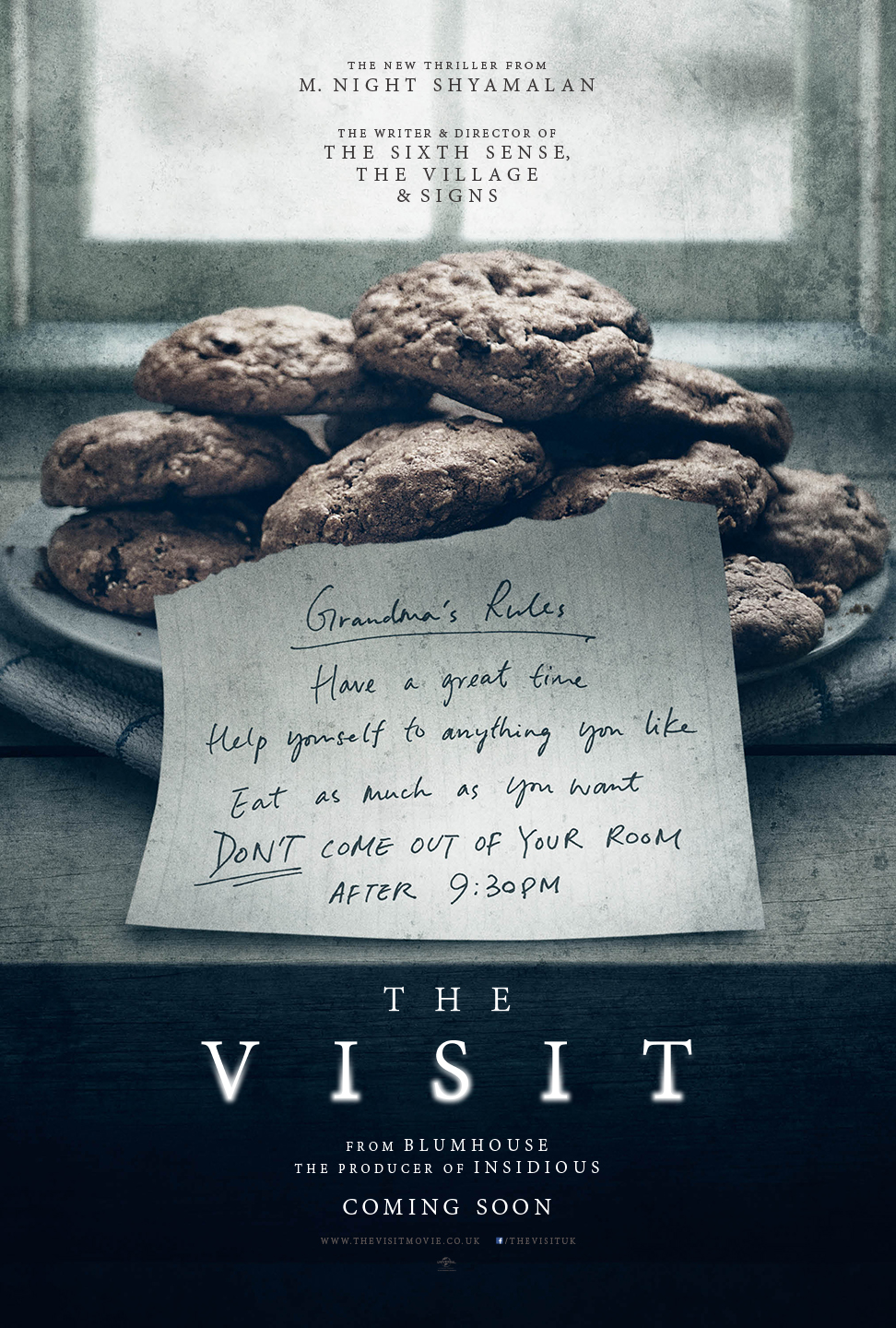


Another reason that we chose to do a horror trailer is because of the conventions; we believe that they are easy to follow and they also allow us to create more realistic situations; in comparison to an action where the key conventions involve cars and explosions, which would simply be too difficult. There were many films that influenced us to choose this genre and also the fact that we both enjoy this particular genre made the choice much easier. Particular films that influenced us are those that we felt that we could create a similar story-line to; for example The Visit.. which is based around an elderly character of which we have incorporated in our trailer. The next films are Orphan and The Grudge; both films that are focused on children and particularly young girls. Again, we have incorporated this kind of character into our trailer after being influenced by these films. We also feel like audiences can engage more with this, potentially being able to the actions of a young child, or vice versa, being an adult.
Process of editing

These screen-captures show part of the process of creating our titles throughout the trailer. We have incorporated multiple titles throughout to break apart the continuous story-like feel. The process of creating these titles wasn't too difficult for us and after watching the relevant online tutorials, we found it much easier to follow; through changing colour, font, and further adding transitions when fading the title in and out. Titles are significantly important in trailers and in generally any film as they are a way of audiences to engage with the film; this can be done my guiding them through, for example in the screenshot above the title we have used says "are the fears that we create". Recognisably, the collective pronoun 'we' is separate to the rest and the reason for this was that we were adding a special effect to it making it more prominent and this is because the pronoun is engaging the audience.....speaking collectively, as if they are part of the story. As shown in the second screen-capture, we were easily able to change the colour of the font and the software provided us with a range to choose from.

The screenshot here shows the timeline of our editing on the software. The timeline is separated into 4 different sections which are;
1. video
2.audio
3. narration
4. soundtrack

It is clear in the timeline how we have used the four different sections where overlapping videos, audio, narration and soundtrack. An area where we have particularly overlapped in this image is when adding titles and transitions over the video clips. The creation of titles in our trailer was a key focus as we had to incorporate multiple titles in order to break apart the continuous story-feel. Therefore it was important that we were able to bring in and overlap the titles at appropriate times throughout the editing process. Also with using this software, we are able to re-visit/re-add anything at any stage of the process if needed and this is often the case when creating film where the titles tend to be the last thing that are created/added.
The reason for having these different sections is so that we can overlap and this is important in the creation of our trailer as we will be adding and overlapping many different titles but also getting sound from another source (due to barriers we faced throughout the filming process), meaning that we are able to place and edit the sound into the correct places.

Transitions and Effects:
The image on the right shows a section of the software which allows you to add transitions and image effects. Transitions are important to consider when adding in tiles; where it would be effective to, for example, fade in and fade out the title rather than just having it appear on the screen which is quite basic. There are multiple transitions that we are able to choose from, and a few that we thought would be effective and slightly conventional of our horror genre. For example, our first title that is introduced is one of the institutions named 'Robyn Productions'. When bringing in this title, we used the 'slash slide' transition which as suggested, it slashes up the text. This is an effective use of transition in our trailer as it this kind of affect proposes the idea of danger which is conventional of a horror.
Potential Equipment usage

 During our preliminary filming, we tried and played around using a Fig Rig-wheel to support our camera. In previous filming's (such as our AS level opening) we simply used a tripod - which allowed us to capture steady shots, using different angles and rotations. We had no issues with using this tripod however this year we decided to test out the Fig Rig wheel which is extremely different to the usual tripod - it has a circular frame (as shown in the images) with a crossbar to mount the camera. When doing these preliminary filming's and test shots we found that it was effective with not having any straps or restrictions where we were able to make quick and wide movements in the same shot - ranging from ground level to overhead in one smooth movement. Also, the operator and camera became one which was most efficient with being able to film quickly (if needed) but also making any movement and still continuing the smoothness with one shot. This however is not the case when using a tripod as changing angles and height involves making adjustments to the camera and the tripod itself, reducing the efficiency.
Despite the positives of this piece of equipment, the decision we made not to use it was primarily that we wanted our trailer to feel more simplistic and use conventions of horror movies; where the camera usage is like a home camera... making it more realistic and scary - for example like paranormal activity. We felt like this piece of equipment would not give this effect and that it was much more high-tech.. in the sense that it would be most effective in an action, for example. Most likely when filming fast-paced scenes such as car chases, explosions and crashes, missions, etc.

 Another reason for not using this piece of equipment was the accessibility to having it at any time. This equipment was not something that we had full use of, which is why we only tested it in our preliminary shots to see if it was worth purchasing or worth filming immediately in a short space of time. In comparison the tripod was a piece of equipment that we were provided with and which we had full access to at any time allowing us to film wherever, whenever. We felt like this was important, in the slight case that we may have to re-film or re-capture something - we were easily able to with using the tripod.
The images here are showing us using the piece of equipment and capturing different shots and angles in our preliminary filming's. The preliminary filming were done in preparation for our actual filming of the trailer, and was general practice with testing out different pieces of equipment and deciding which was best for us and our trailer.
Monday, 6 February 2017
Post Trailer Questions
Post Trailer Questions
- Why did you choose the horror genre?
- What did you find the hardest part of the filming process?
- How well do you think the characters fitted in with their surroundings/location?
- How have you used elements of sound in your trailer?DIEGETIC/NON-DIEGETIC
- What are your likes and dislikes on the editing software?ADOBE PREMIERE ELEMENTS
- When filming, were there any barriers or problems and how did you work with them?
- Why did you choose the location you did?
- How did you work well as a filming team?
- How do you think is film stands out from others?
Thursday, 2 February 2017
Barriers of the editing software

Despite this software providing us with many features that allowed us to edit and create our trailer - there were
barriers that we had to overcome throughout the process - and this was mainly having to render the clips nearly
every time we made a slight change.
Rendering processes the layers and effects and saves the preview into a file, which Adobe Premiere Elements
can use each time you preview that section of the movie. Once rendered, a section doesn't require re-rendering
unless changes are made to it.
This was a barrier during the editing process as it was extremely time consuming and was a set back every
time a slight change was made. It was often that this made the software freeze or crash; which understandably
is expected with the amount of clips that the software had to deal with... however this was a struggle for us to
deal with.
More complex movies require more processing time to display properly. With our trailer having multiple different
clips and also adding sound, titles and transitions, etc, it was clear that this was going to become an issue for
us however, the software has still allowed to create an effectively edited trailer. We ensured that everything we
done was saved after each change in-case the site did go wrong. Also to save time, we rendered the clips more
often so each time was shorter, rather than doing it all together at the end where it might be more difficult as
there would be more to process.
Subscribe to:
Posts (Atom)