Friday, 9 September 2016

magazine cover #5


This particular magazine cover took my eye with its fierce direct mode of address through the visual of 'maleficent' a antagonist recognisable by her iconic horns, cheekbones and supernatural presence. The eye line is directly central to the page, making audiences feel addressed and targeted by this character presence. ironically, the physical eye line match and address catches audiences eyes too.

The colour scheme and hues used for the cover page are blues, creating a surreal and almost dream like state for the page, connoting supernatural and peace with the blues- as well as linking to the sky- which, with a understanding of the context of the entire film itself, the maleficent creature soars through the heights of the sky. contrasting with these blue hues is the yellow highlighting on the page with by-lines and text in yellow hue textboxes which reinforces these particular points making them appear prominent on the page. Some of the yellow highlighted phrases and terms are 'including' and 'maleficent' which draw audience attention towards this. The yellow strip across the lower third of the page highlights imagery that symbolically raises attention to some of the articles included in the magazine. this strip is effective as it almost appears like a film reel/ film strip; a effective feature of the magazine reinforcing the film focus of the magazine. This similar technique is one I intend to adopt for my own magazine cover so from afar and from just the visual aids audiences can tell the the genre and mode of the magazine just from its front.

the way that the imagery on the magazine cover overlaps the magazine title 'total film' reinforces its dominance on the page, as well as making it appear hyperreal because the imagery which is in fact a creation of imagination and media- has more dominance than the magazine company and title itself which contrastingly is real and commercial, this makes it seem as if fantasy has overrules and overcome reality. Also, due to the font of the magazine title being so recognisable, it isn't obliged that every letter of the title is seen, in fact covering some of the letters with the imagery is not an issue as it is still clear to audiences with a pragmatic understanding of the magazine and the title what the text says.

the repetition of the attributive adjective 'epic' reinforces the extreme success and brilliance of the film. By using a repetition technique audiences are reminded of just how good the advertised movie is, hence drawing them in to watch it despite the bias attitude of the opinion. even without reinforcement from reviews such as the clichéd 'guardian review' and 1-5 star ratings often plastered over magazine covers,calling this movie 'epic' alone, gives it credibility and intreiges audiences to watch it...hence the magazine cover has a double ripple effect in both advertising the magazine itself, aswell as intentionally causing a dual marketing approach by advertising maleficent too- especially considering it Is most dominant on the page.


This magazine cover stood out to me personally on internet sources because of its direct mode of address through the eyeline match and camera stare of antagonist-Sweeney Todd played by USP Oscar winning film-star Johnny Depp, a recognizable and prevalent figure in supernatural, dark TV drama and film. This entices audiences who are already familiar with Depp from films of a similar or same genre. Referencing back to the direct eye contact Depp makes with viewers and readers of the magazine, the makeup surrounding his eyes, a feature of mise en scene as this adds to his costume and general appearance, makes him seem un-human and hence his gaze is even more patronizing and daunting. The red circles underneath his eyes are emphasized possibly through harsh editing making them appear to un naturally bulge and stand out, whilst his brows are suggestive of his body language and para linguistic features showing a harrowing anger. it is important that Depp's expression reveals a lot, as well as giving audiences meta messages to understand as the format of the magazine is a written format and hence no visual moving media or overwhelming text inclusions can be used.

Because the legend of Sweeney Todd is a familiar fable many people- especially the audience profile in the demographics model of 'explorers' who suggestively have a high IQ and are of young age, in this way Sweeney Todd's characteristics would be recognized and audiences feel familiar with, liking to the uses and gratifications theory suggested by Blumler and Katz suggesting audiences want to associate with characters. the silver streak of hair, white face, barber style collar and curly locks of hair are collocations of the infamous and historical barber 'Sweeny Todd' and hence, for the magazine cover using such a large scale picture that dominates the page of just one character heightens the impact of the film, as well as drawing audiences in. To assist in the impact this makes, the credit 'Starring Johnny Depp' reinforces to audiences the famous unique selling point film star that is the antagonist of the film. The white bold font of this also stands out against the monochromatic dull shadowy background making it even more prevalent. alongside this, a collection of titles are used to border the image, such as '39 new films' which gives credibility to the magazine making it seem worthy of the money people pay, as well as purposeful, informative and entertaining.

Research Feedback

Some very good analysis so far Hollie - and I'm really looking forward to being a part of your journey this year.  Evidence more analysis of magazine and poster - and link their appeal to the wider campaign/  Hone in on your chosen genre now.  Well done

Genre Research

ACTION:
films categorized under the genre 'action' tend to commonly include huge financial backing and   big-budget stunts along with technological computer generated imagery (CGI). Action films commonly also maintain typical conventions such as physical stunts,chases, and rescue from difficult physically and mentally challenging dilemmas. Battles ,fights and ideas of escapism and non stop motion often permeate action films. conventions of action films also consider the spectacular rhythm and pacing of the story line and the characters in action films that revolve around this story line are often two dimensional 'good guy' heroes or heroines battling the bad guys. the main purpose of this genre, relating back to its conventions, is for audience escapism. Examples of action films consist of the James bond series,

similarly to action films -Adventure films are usually exciting stories, with new experiences or exotic locations. Action and adventure pair very effectively together. adventure films, as hinted in the title often include a search or adventure to find something that's 'lost' this often includes searching for lost continents, jungles, treasure or even the unknown. films such as Indiana Jones and Jurassic park would be considered as adventure. searches or expeditions for lost continents, "jungle" and "desert" epics, treasure hunts, disaster films, or searches for the unknown.


 COMEDY:
Comedies earn their title from their comedic nature and light-hearted plots consistently and deliberately designed to amuse and provoke laughter. Typical comedies contain jokes, puns, one liners and deliberate pranks or clumsy stunts. In addition many comedies actually star famous comedians, having famous comedians flaunted on posters and comedy films is a USP (unique selling point) so for films that star the likes of Kevin Hart or Ricky Gervais, if that audience have seen their stand up-they are likely to watch films they star in. comedies typically also exaggerate situations, language, relationships,language and action making dilemmas seem worse of funnier than they are. The sub categories of comedy include slapstick, Rom coms (romantic comedies) black comedy and spoofs/ paradoys. examples of comedies are those like dumb and dumber, get hard, step brothers and i give it a year.


CRIME &GANGSTER:
Crime& gangster orientated films primarily follow the path of criminals, groups/gangs or criminals or a prominent even mysterious sinister action. Often crime thrillers and gangster films have a predominant focus of money-whether this is in the form of bank robbery, themes of ransom or even just the general theme of payment and debt.  film noir or detective mystery films are two alternative genre classifications for crime and gangster films. serial killer and murder films are also classified under the title of crime and gangster. Typical mise-en-scene of crime and gangster films have costume that revolves around the idea of formality and gangster wear- like black glasses and a black suit and tie. Also, may crime films actually covert to the usual stereotype of criminals being obvious robbers and evil people- in fact usually the real villains or 'baddies' are actually unexpected, plot twisting subtle characters.
examples of crime and gangster films are films like Good fellas, legend, the gangster and casino.

DRAMA:
Dramatized films have a plot that is frequently portrayed to be realistic, with relatable and realistic characters, settings and life situations and dilemmas. the context of dramatized films often actually hold some form of realistic non fictional truth. drams often have intense character development and interaction, with a limited cast so the audience can relate and get to know the characters in a more understanding way. usually, dramas are not concerned with special effects,CGI or comedy...they just obtain key aspects like having exceptional acting and very realistic plots. Dramas can also be specially made in response to key news or recent events to almost illustrate an occurrence in a visual way...these types of dramas often feature on TV. Drama is probably one of the largest film genres and there are many sub-genres under the same category such as historical dramas and epics, Biopics (which are dramatized biographical films) and romantic dramas.  examples of drama films would be Forrest Gump, schindlers list, the Godfather and the changeling.


HORROR:
Horror films have a primary purpose to frighten or invoke hidden or fearful subjects from an audience. This alone makes horror movies one of the most interactive film genres as they often don't depend on a creative or ingenious plot or story line- its more about how they will scare their audience. A typical feature of horror movies are their often shocking finale scenes, where often, we realize that the whole cast almost-is dead.  horror movies for an audience are described to be a  'cathartic experience'...horror movie producers intend to use jump scares, relatable topics, everyday life idea of routine with added often gruesome and terrifying implications. There are a huge variety of horror film sub-categories...from horror films that use CGI to create un-thinkable monsters, horror movies on low budgets and horror movies that use gore, and horror movies that are simply disturbingly relatable to something that 'could' be real. They are often combined with sci-fi films when the menace or monster is related to a corruption of technology, or when Earth is threatened by aliens. examples of horror movies would be the exorcist, Ouija, psycho and a nightmare on elm street.

SCIENCE FICTION:
science fiction films- also known as sci-fi always tend to have a scientific basis-hence the name....whether this is a futuristic invention type of science or alienated science. sci-fis are visionary and imaginative and adopt the key aspects of adjacent movie genres like heroes, impossible quests and villains however sci fi films are famous for their improbable settings,futuristic forces and technology and monstrous opposition. Science fiction films heavily relate to fantasy films and share many of the key features of action and adventure films however they use more special effects, CGI and basis in the future whether it is dystopian or simply modernized.


Filtered genre research- specialising in horror

Horror films have a primary purpose to frighten or invoke hidden or fearful subjects from an
audience. This alone makes horror movies one of the most interactive film genres as they often don't depend on a creative or ingenious plot or story line- its more about how they will scare their audience. A typical feature of horror movies are their often shocking finale scenes, where often, we realize that the whole cast almost-is dead.  horror movies for an audience are described to be a  'cathartic experience'...horror movie producers intend to use jump scares, relatable topics, everyday life idea of routine with added often gruesome and terrifying implications. There are a huge variety of horror film sub-categories...from horror films that use CGI to create un-thinkable monsters, horror movies on low budgets and horror movies that use gore, and horror movies that are simply disturbingly relatable to something that 'could' be real. They are often combined with sci-fi films when the menace or monster is related to a corruption of technology, or when Earth is threatened by aliens. examples of horror movies would be the exorcist, Ouija, psycho and a nightmare on elm street. 

our particular horror movie would most likely be sub-categorized under mainstream horror because it is an authentic and individual idea as well as being set within our modern age. In a different perspective however it could be seen as a zombie/monster film as our main character has risen from the dead. These types of horror movies particularly appeal to older teenagers who want a modernized thrill or fright and is probably the most popular horror category as themes of severe gore or unrealistic vampire and zombie themes or even psychopathic horror do not have a major focus therefore not limiting and putting off audiences.

Horror films are one of the oldest movie crazes and genres going back over a 100 years ago. warped thoughts and vivid imaginations have always tended to trigger the minds warped thoughts to see ghosts in shadowy shapes and fear of the dark and its connotations....creating an emotional connection to the unknown and the improbable making the horror genre highly popular as it is not only a movie to watch but an experience
.Watching a horror film  is particularly effective as it gives an opening into that scary world, into an outlet for the sense of fear and horror.. without actually being in danger. There is a heightened thrill factor associated with watching horror movies, and they allow through imagery horror ideas to come alive like a book or novel would never depict. The first horror movie, only about two minutes long, was made by imaginative French filmmaker Georges Melies, titled Le Manoir Du Diable in 1896 (aka The Devil's Castle/The Haunted Castle) - 

Oscar Wilde's 1890 Faustian tale (Faust is the protagonist of a classic German folklore tale- He is a scholar who is highly successful yet dissatisfied with his life, which leads him to make a pact with the Devil, exchanging his soul for unlimited knowledge and pleasures) The Picture of Dorian Gray and H.G. Wells' 1896 story of The Island of Dr. Moreau were adapted into early film versions firstly shown in German cinemas. In many ways, the German silent cinema began the trend of watching horror movies because the silence and jump scares attracted huge audiences of people wanting to truly be engaged and attatched to a film.

Vampires began to emerge in popular fiction of the 18th and 19th centuries, during which time Dracula was written. Vampire portrayal in the media over time has evolved and developed from evil ugly creatures to immortals that represent beauty and lust.Image result for the history of horror filmsImage result for the history of horror films


Audience profiling and target audience research

when researching our audience for the horror movie we have proposed, we needed to consider many different things. firstly, although there is only a small margin between gender preferences towards horror movies- there is a significant 16% difference in who watches horror movies more- with women being more popular viewers. this allowed us to make the conclusion to include a main female antagonist/ protagonist to influence the story line. In addition, we saw an open market here to create an appeal here to attract a wider male audience- influencing why we choose for our car driver to be a male, with masculine habits that viewing males can relate to. in contrast, the sky horror channel reported that 58% of their viewers are male.  In the other statistical chart it is clear to see that the least likely audience for our horror movie would be 50+, however there was too a low percentage of older adults in their 30s to 40s which allowed us to create a film based more around themes younger adults would grasp and be involved in watching.


In our investigation into audience profiling and target audiences, i found that this video showing audience reactions to a horror based stage performance that considers itself to be one of the scariest productions..targeted at a 15+ audience. I myself went to see the 'Ghost Stories' which acted as inspiration to our movie making process because Ghost Stories is based around making audiences feel as if everything they include is completely realistic and chillingly evidenced. From this, we wanted to ensure our film seemed realistic and it came across as relatable and serious to audiences. the video showing audience reactions was useful to our audience profiling task because for this type of reaction we need to ensure we include key features and typical aspects of horrors like the jump scares and edge-of-seat plots. The video also gave us an insight into some of the key people who watch horrors and realistic mainstream horror performances like this...as we could see in the movie the audience was filled with lots of young adults.

Image result for uni studentsThis image is a portrayal of somebody who we would aim our movie towards-this female is 24 years old with a fairly middle class status. generally, this specific age range has a particularly good social life- with connections from university or college education systems as well as work and external friendships. a statistic from factbrowser.com states that 66% of Americans aged 24 go to the movies in groups of at least 3 people- which would be the direct appeal for our movie as horrors are generally not viewed by individual single audience members. Also,our mainstream horror directly appeals to this audience profile because other horrors like cult horrors, series/sequeled horrors and classics like the exorcist, nightmare on elm street all have an older generation audience and we wanted our movie to be more modern and relevant to the times now. Also, the strong gory themes with alcohol abuse and the death of a child may be too graphic and much younger teens under the age categorization of 15. also an online survey sponsored by the lottery fund, gives statistics that social class C2 consisting of skilled working class with below average incomes enjoy watching horror movies the most compared to other classes, however we have aimed to make our film approachable by all social classes.
                                                                                              
 Here i have included a psycho-graphics graph. this allows us to have an insight into our target audience and allows us to target an even more specific group of people. This is more relevant for movie marketing as knowing likes and dislikes of specific groups from this theory enable promotion to be easier, however for our movie it is still to be thoroughly considered. Physcho graphics take into consideration the behavior and averaged personalities of the audience rather than the simple typical categorizations simply by age and gender which can give very vague targeting. For our movie when sub categorizing the audience we would aim the film at the 'Explorer' audience because they often seek adventure and new things...they would be in for a thrill and sensation. This seeking for sensation is also shared by the struggler category so this audience group would too be an audience target for our film.


Certificate research for our trailer/movie

Image result for film certificate ratings

We analysed film ratings so that we could promote our film towards the most effective audience and designated niche market. Typically horrors are not governed towards any ideal audience under the age of 15. however, the woman in black stands as an exception because it is a historical classic novel that was deemed acceptable by the BBFC in addition to the horror based film 'the hole'. 'The Hole' was accepted as a twelve rating predominantly because of the usage of young upcoming actors featuring in CBBC and CITV programs. We considered making our film a 12 because we wanted the opening to focus on an effective inventive story-line and plot rather than just aspects of horror and scary or gory scenes. If there was actually a moral behind our story it could be classified as a 12 and therfore appeal to a wider and more broadly aged audience..this means we could still include  jump scares and possibly disturbing scenes without the usage of strong gore and death. Usually most 12 films are action movies or thrillers, so our movie would be distinctive and we would have to argue our reasons for allowing a horror based thriller to be a 12 certificate. The BBFC state that some horrors may be passed under the 12/12A category with moderate physical and psychological threat permitted along as horror scenes are infrequent with an overall tone that isn't disturbing and infrequent swearing or taboo language or nudity. Also, twelve rated films cannot involve harsh incorrect drug usage or promotion-which our film wouldn't. We were thinking of having a focus in our film on alcohol abuse with a driver involved who acts as if he had been heavily drinking, however we haven't confirmed this idea and need to further work on the age rating for this type of alcoholism.
The most obvious choice for a horror film rating is to aim it at a 15+ audience because this would appeal to teenagers who enjoy the idea of being scared and going to the cinema as a planned event to watch a horror movie. Also a 15+ audience would be more mature and therefore the story-line could touch on different more adult topics. film examiners look at issues when rating a film such as discrimination, drugs, horror themes, imitable behavior, language, nudity, sex and sexual violence and theme. The idea of imitable behavior is a subject to be carefully considered when creating our film because any ideas of danger or violence need to be considered as to what audience we are portraying this to, especially with our idea of the inclusion of roadside issues and reckless driving. Films are also considered under context, tone and impact of how it may make an audience feel; there is also the consideration of the release format- for example if it is released on DVD is there a higher risk of underage viewing. 15 films accept racist, homophobic and discriminatory language as well as strong taboo words and even the strongest language terms like f**k and c**t (depending on manner of use). 15 films are also allowed to include lengthy sexual activity and nudity in a sexual context without strong detail. 15 films also allow strong violence however no dwelling on the infliction of pain or injury, strong sadistic violence is however unacceptable and continually gory films are rated 18s. 15 films allow detailed verbal references to sexual violence for example descriptions of rape or sexual assault in a courtroom scene or in testimony however depiction of sexual violence is not allowed or must alternatively be completely justified in context of the story-line of the film. We know that our horror wouldn't break any of the 15 rating boundaries because there can be strong threat and dark horror as long as there is not a sustained focus on sadistic and sexualised horror and threat- which wouldn't be flaunted at all in our film.

i wanted to research how 18 films differed so wildly from the 15 rating and why you need to be within adulthood for watching 18 movies. when i analysed the film rating, it realized that it was because of inclusions of very strong violence, strong and frequent language, strong horror and sexual activity as well as sexual violence, blood and gore and discriminatory language and behavior. at 18 there is no themes prohibited and adults are free to choose their own entertainment providing the material is not illegal or harmful- this means that this particular categorization for film ratings can even be offensive to adult viewers. Although adults can watch what they want- there is potential aspects that could be cut from an 18 movie if there is material that breaches the criminal law or where material has very detailed portrayal of illegal drug use and sexual and strong violence for example making rape look appealing. Rating a film an 18 cuts out 25% of movie goers as 15% are aged 2-11 and 10% 12-17. This means that by making our movie a 15 we would have a wider audience to promote our film to, as teenagers make up a wide population (at least 8% are 15) and would create more of a broad viewing population & income.


MAGAZINE cover- Empire, Batman #2


Image result for empire magazine bane
I chose to analyse this cover of empire magazine because the image stands out to appear domineering and intimidating which makes it interesting to analyse what exactly about it makes it so bold and stark to viewers and readers. in addition to this i found the cover interesting because it conveys connotations of the horror genre with the masked antagonist on the front when in fact it is a character from batman which is an action movie rather than horror despite the conventional traits expressed from banes character on the front page. It is also interesting that the movie uses the antagonist on the front page rather than protagonist batman...this implies that in the finale movie of the batman series perhaps bane is a more difficult oppressor that may leave audiences questioning whether batman as the films protagonist and superhero will win. 
the batman logo in the left hand corner will create an almost virtual semantic field implying the movie poster is all interlinked with the batman theme. It is a highly recognizable logo so automatically audiences will be able to understand what the bat stands for. The white highlighted hue of the bat makes it almost look triumphant as the white links with purity whilst its glow potentially links with success. the black background the bat logo is on makes it stand out so audiences can recognize it straight away, as well as it showing just through the usage of color the idea of batman the protagonist displayed with the white glowing bat against oppression from bane with the black background.

the empire masthead is overlayed by banes character however this just shows how renown and recognizable the magazine itself and the font of the masthead is that you don't even need to see the lettering in its entirety to know what magazine it is. There is also no skyline masthead above this with smaller details and pricing giving complete importance and prominence to banes character on the front page rather than anything else. The advertorials on the right and left hand sides of the front cover also don't take away banes prevalence on the front page as they fit in with a subtle almost monochromatic color scheme and are all hues that are dark which is reflective of banes dark clothing (part of mise en scene) as well as his dark persona,

The cover line 'the dark knight rises' is very satirical as it juxtaposes how the dark knight is in fact batman although he has not been portrayed on this front cover instead it is his oppressor which is interesting drawing in audiences to find out more and uncover the enigma as to whether batman as the dark knight does in fact rise, or whether the dark knight as a title for the film stands for something far more sinister and truly dark such as bane. The white font that is used for the cover line stands out the most out of all the text hues and colors on the front page giving the films title prominence and boldness.


MAGAZINE cover- empire #1

This film based magazine cover immediately appealed to me as it focuses on the emotive portrayal of a character, which is a technique we would aim to include in our own magazine covers as this draws in audience attention and makes the magazine cover appear dense and action packed rather than using a long shot, establishing or deep focus shot that would loose the dramatic effect of the imagery.
As well as the close up image, the masthead is what would catch audiences attention as its bold red tone and recognizable font would stand out to audiences, importantly, standing out before the price of £3.99 does, as competitive magazines in the industry sell for far cheaper. however, the date '8th august' indicates this magazine is a monthly edition as it isn't indicative of the week beg/ ending which is perhaps responsible for the pricing. The red is a staple color used for EMPIRE magazines, however co ordinating mise en scene with the blood on harry potters face and his red jacket creates almost a tone for the magazine making it seem more professional. the other colors used; black and yellow, contribute to maintaining the three 'danger' colors- red connoting warning, and the yellow and black connoting danger. this in turn gives the magazine cover an enigma effect- audiences will want to know what the danger is, what the importance is.

Underneath the masthead, the subheading is inclusive of superlatives and positive adjectives such as 'special' and 'massive' and imperatives 'right now' 'you need to'. this tempts audiences further to find out what the magazine entails, and they feel like they are being instructed to read into the magazine. The variation in title size, font, italics, boldness and capitalization makes the page seem less dominated by text and more aesthetically pleasing for audiences. simplistic lexis choices are used to only give away key words and smaller details, not giving away too much about what the magazine includes.

The cuts on daniel radcliffes face and injuries are an enigma, we as audeinces do not know where these have come from, yet want to find out more and be enlightened as to what has happened, this hence creates even more of an appeal for the film. The cracked glasses too are a usage of mise en scene with this prop showing almost the breadown of the charachter of harry potter as his glasses are a connotative symbol of his charachters that audeinces would see and recognise, much like supermans cape, or donnie darkos rabbit mask, freddy kruegers razors- harry potters glasses are what define him, so hence having one cracked destroyed lens and one perfect lens suggests a battele between good and evil, an internal battle possibly. this creates even more enigma codes about what evil will be involved, particularly from harry potter enthusiasts having more of a pragmatic understanding of the storylines with dementors that could come into play, especially with the dark black background connoting their coloured spirits. The cracked glasses could also create the idea of a hamartia or weakness that harry obtains- as seeing is a dominant and very necessary sense so for him to partiallty not be seeing straight it suggests he is flawed against competition, and that he is perhaps not physically or metaphorically seeing straight.


Thursday, 8 September 2016

POSTER analysis #6- horror- sinister


the cracked wallpaper that creates a decaying and dull setting for the movie, conveys a sense of horror by paralleling a homely wallpapered house interior with this moldy blood stained paper and a young girl in the foreground of this with her pink childish pajamas and innocent blonde hair creating the archetype of a girly girl with a sinister sense of horror. the way the wallpaper takes up the entirety of the poster, it gives out a message that something is perhaps beyond or lurking behind this barrier, creating an enigma as audiences will want to find out what is hiding in the shadows. the blood strains on the wall are a very dark red, almost as if the blood has congealed, giving a more eerie and 'sinister' tone to the poster...ironic as sinister is the films title is this is evidently the emotion it is trying to convey. the title, using the same color scheme as the blood, is bold on the white background, making it stand out and be even more striking to audiences who will hence remember its title- which is very important as other than the title, there is no date of release or anything else to remember or recognize this movie by. The title also looks as if it is on the wall, due to the shadowing and water marks below it, even though it has been edited and imposed and this effect makes the poster seem almost surreal and realistic as none of the imagery looks unrealistic or imposed.

By boldly noting that the directors of this film have created horrors and psychological thrillers of the likes of paranormal activity and insidious, this film poster directly appeals to a specific field of audience members who enjoy and appreciate horror movies. By not even mentioning the directors name, this indicated the director is presumed to be recognized just by his cinematic achievements, and implied to be very famous- hence giving this film a sense of credibility and attraction. the contrast of this white writing along with the girls white pajamas and the white wall with the blood red title and wall stains makes the poster starkly stand out, and also convey a parallel of heaven and hell through color connotations with the white being heaven and the red that permeates the screen being hell- suggestive to audiences that the darkness, or hell, is most prevalent. this hellish idea is reinforced by the wall picture featuring a pair of demonic eyes which appear to be staring straight at the audience. this will create a audience attraction and entice more viewers. The direct stare from the demonic eyes also links in with the direct mode of address in the quote 'will scare the hell out of you' from a magazine review on the right third of the poster. using this first person pronoun, direct contact is made with audiences making them feel almost targeted or victimized by the antagonist of the horror.

the young girl used in the poster is a feature we would aim to use in our own movie and movie poster as conventionally in horror movies children and the female gender are weaker and seen as more vulnerable and typically targeted by a exterior darkness. With the young girl here we dont get to see her face, so this acts as an enigma to the film that audiences will want to uncover. The young girl also appears to be sleepwalking connoted by the mise en scene aspect of her pjyma wear, which suggests that the films plot is based on nightmares, a typical collocation of horror movies- which is what some of the best horror movie plots revolve around.


POSTER analysis #5- The Machinist


POSTER analysis #4 inception


POSTER analysis #3- Nightmare on elm street


POSTER analysis #2- horror poster: The Conjouring

I chose to analyse this film poster as it adhered to our proposed film genre we want to make a trailer for, as well as being minimalist and easy to recreate something similar if we were to make a film poster inspired by this. It uses subtle editing techniques without special effects, fierce photo-shopping or enhancing making the poster convey a raw and realistic affect to its audiences.

firstly, the typography of the title with its simplistic black font uses no fancy or unrealistic coloring's or extravagant fonts making it stand out even more and its 'times new roman' font similarities make it seem similar to the written hand typography of historical documents, already giving the film historical context and making it seem more realistic. having the entire title capitalized gives it prominence- and as well as this the verb 'conjuring' is larger than 'the' showing its importance and power. The byline 'based on the true case files of the warrens' implies a pragmatic understanding that audiences know who the warrens are, and if not, will conduct further research to find out who they are as it will give more meaning to the film. it also merges in to the film poster the idea of hyper reality, blurring the lines between real happenings and the films made up plot aversions. This byline also conveys a documentary style genre to the film- also portrayed with the lack of text and movie characters and actors so it combines the true non fictional genre of a documentary with fictional horror attracting audiences as this acts like a unique selling point. with the absence of any large scale actor names as unique selling points, this keeps audiences in tension and anticipation for when they watch the full movie, it creates an enigma out of which known actors may be in this film. This is a common convention of most horror movies, to re enforce the element of surprise and shock. 

The top byline 'from the director of saw an insidious' is a unique selling point to the film because these hugely successful horror movie series' are highly watched, rated and recommended films- topping rotten tomatoes and film review sites as some of the best horror movies ever created, hence The Conjuring would be expected to be just the same. By just saying 'director of' instead of 'James wan'- the directors actual name, it creates an enigma around the film, bringing a sense of eeriness as it as if the director is almost hidden, relating to the films plot and hidden characters making the whole movie poster seem even more suspicious and eerie. The vague mention of the film 'coming soon' with the absence of an official date contributes to the sense of the unknown in the poster- which almost gives a tone and style to the poster.

The picture itself on the poster sets the setting for the movie, an effective attribute in film posters and film openings to familiarize audiences with the setting so it seems more real, and they feel like they too are in that setting (linking to the hypperreal). The abstract imagery makes audiences look deeper into the image, as nothing is obvious. audiences would be questioning the relevance of the house- what went on there? why there is a shadow towards the bottom of the poster? the relevance of the noose hanging from the tree? The setting conveyed also sets a tone for the movie, with its eerie misty surroundings conveying a sense of pathetic fallacy with these gloomy dull lifeless low saturation weather linking to themes within the films plot. The lonely barren setting leaves audiences wanting to unveil what is lurking in the darkness, especially with the austere tones. the juxtaposition of the dead tree in the foreground and house in the background in shallow focus contrasts the theme of death symbolically portrayed by the tree with life which you'd associate with a house/home environment. This hence presents death as a more prevalent theme than life in the movie poster.

The twitter hashtag in the credits block encourages audiences to head on to social media to find out more, and also would create a viral marketing campaign combining the hypperreal as people would advertise the film itself online through talking about it on twitter, without even having to see this poster. this is perhaps why the poster gives away such few details, as it can rely on social media and viral marketing to get the film advertised. this method of advertisement with interactive editions and online editions of this exact poster available is only a 21st century approach to film marketing whereas in the 19th century all film producers could rely on was the posters and theatrical trailers, and hence posters had to give away a lot more e.g dates, actors, plot summaries in comparison with this very vague poster above. 

The way in which the billing board of directors and producers is placed in the left hand bottom corner of the poster rather than the right is unconventional of movie posters as typically these credits are in the right hand corner. This draws attention to the shadowed silhouette in the bottom third of the poster as this is the reason for the credits being moved, hence, audiences would naturally and subconciously notice this easily and its eerie appearance would be conveyed.


POSTER analysis #1- House at the end of the street

Image result for house at the end of the street film poster
I chose to analyse this film poster because immediately from its stylistic features it is evident that this film is going to be a horror which withholds links with the genre we are hoping to study and base a film trailer on.

The left hand side of the poster features Jennifer Lawrence face poising a scared expression. Her face is highlighted with a higher saturation and brightness making her stand out in contrast to the dark black shadowy background. Also typical connotations of her white pale facial tone associate fear, fright and desolation with her features.

Also, the dark black makeup around her eyes make them stand out on the poster and as many critics have argued 'eyes are the window to a person/actors emotions' this gives away hints about our protagonist and the fear she may encounter during the movie. The fact that Jennifer Lawrence has such prevalence on this poster is interesting because typical conventions of horror movies dont feature main actors just eerie situations or gruesome or obscure objects or scenes or even the monster or ghoul in the horror rather than the main character however here because of Lawrences prior fame from being in the hunger games trilogy she will act as a unique selling point for audiences wanting to see the film. The direct audience address from Jennifer Lawerence draws audiences in by making them feel targeted and directed at by the poster. Especially in horror movies direct mode of address is a typical and stylistic trait in making audiences reciprocate the fear that the main character is feeling. Audiences will have known of Lawerence as an actor before her role in this movie after the hunger games box office success so they would recognize her as a heroic protagonist so possibly already be able to associate themselves with Lawrences character in this movie creating a connection and urge to see the movie,

The dark shadowy figure depicted in the window of the house creates a sense of fear and an enigma to the movie as audiences would want to find out who/what this shadow is. Typically of horror movies they create a sense of awaiting and build up of tension before revealing what is lurking in the shadows. The subject pronoun usage of 'its' (fear its secret) used underneath the shadow of the 'thing' in the window creates a impersonal connection with whatever may be in the shadows as its being objectified and impersonalised rather than being referred to as a being. 'its' could also however be referring to the house which is a typical convention of horror movies having a haunted house. The lexical word choices of 'secret' 'deeply' and 'twist' in some of the posters captions link to the semantic field of secrecy and freight,

The color choice of yellow on the black background stands out as black and yellow together are used as warning colors, in the real world on warning tape. Also having yellow for the text instead of cliche horror movie titling colors such as black and red makes this movie stand out- and as i remember seeing it for the first time on the side of a telephone box- draws audiences in to read the title.
The quote from a magazine on the poster helps with the films publicity as well as making it seem more authoritative and credible. The two contrasting word choices of the adjectives 'scary' and 'awesome' hint a sub genre for the film of a thriller or action plot alongside its themes of horror.


SHUTTER ISLAND FILM INVESTIGATION (horror genre hybrid with psychological thriller)

Image result for shutter island poster
FILM POSTER
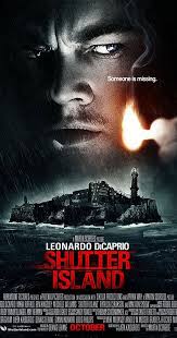
The film poster for Shutter Island interestingly integrates two different images together to possibly give away details about the movies setting and the presumed protagonist of the movie played by Leanardo Dicaprio. The poster adopts a dark sultry colour tone using a black and white style editing filter over the images to perhaps fit in with genre conventions of the movie being a dark thriller. The way that the island aswell as Dicaprios face on this poster both adopt a dark black and white hue shows a connection between the two images creating an enigma to audiences who would want to find out how dicaprio is associated to the island and what it actually is. The bold red text on this dark monochromatic background is similar to the technique used in marketing for the box office horror hit 'Amytiville horror' which too used stark bold red lettering on a monochrome background to stand out. The white smaller capitalized writing above the movies title flaunts the films unique selling point of having leanardo DiCaprio in as he is a prestigious and well known actor that will draw fans and audiences in to see the film as they know he has only appeared in credible and high income movies.

The way that half of dicaprios face is shadowed with a darker aperture whilst the other half of his face is highlighted hints an alter ego, alternate persona as well as a sense of mystery around the character. This same half shadowed editing technique was used on the batman poster when Harvey Dents character who has an alter villainous antagonistic persona in the film was shown on the poster with half his face shadowed and half brightened to represent some of his physical characteristics in the film. Dicaprios character in this film *spoiler alert* has an alternate persona as he is a mental asylum patient (which is the films big twist) so the half shadowed face accurately creates a visual representation of what his character is like as he has a dark side (revealed in the film as he murdered his own wife). Cleverly also, the match DiCaprio is holding in the movie poster brings light to the poster almost as if it is illuminating everything else in the poster which cleverly makes it seem realistic and almost gives a three dimensional sense. As there is no sunlight or artificial lighting used this match brings a sense of raw lighting and realism to the movie poster as well as fire being connotated with fear and death. The light from the match also highlights the films catchphrase 'someone is missing' which gives a subtle enigma triggering hint about the plot as audiences almost feel as if they have to 'find' the person by watching the film themselves. The match representing light is a physical form of light, however it links metaphorically to Dicaprio perhaps shedding light on the situation of who is missing on the island.

The island depicted on the movie poster has been made up by a collection of sharp focus different images which is evident by the waves breaking at different points in each smaller image. This may suggest a jigsaw style plot where audiences have to peice the story line together by themselves which is associated with crime and thriller genre movies where there is an investigation.

The stormy weather portrayed in the movie poster acts as pathetic fallacy because the storm conveys emotion and feeling to the film creating a sense of darkness and fear by using storm features such as the rain and the large breaking waves, this sets the setting relating to mise en scene for the movie.

                                REVIEW OF THE ENTIRE MOVIE:
Image result for shutter island media


"which would be worse – to live as a monster, or to die as a good man?" Teddy Daniels-shutter island

Shutter Island doesn't simply win my vote as my favorite film for the main role played by the strikingly gorgeous Leonardo DiCaprio but but also because the plot devised by best selling novelist Dennis Lehane adapted by screenwriter  Martin scorese is quite frankly ingenuous. DiCaprio himself even  described  the filming as 'emotionally grueling' and whilst he spent endless hours in front of the cameras acting in his 'most challenging film to date' we are presented with a two hour clean cut of of superb indulgence in a superb motion picture. The 'blogsphere' has been awash with debate about what truly happens in the final scene of the movie and in awe of the clever twist-however i don't dare to dig into and reveal as much information as that to any virgins of watching shutter island.          

          Now, shutter island is not some mundane clone of a out-dated book....its more of a teasing enigma encased within a splendid plot inevitable to have huge twists and revelations. Categorized as a thriller; the movie really does inherit themes involving crime(beyond belief) an exciting story and the typical espionage(on a rather small scale although).

          The film revolves around The book's protagonist and the films leading character, Teddy Daniels, who's 'apparently' (you'll understand everything when you watch the film-promise) a US marshal, who turns out to be a deranged killer named Andrew Laeddis. (SPOILER ALERT-sorry) during the film we learn that Laeddis is  a patient in a mental hospital who's been encouraged by his psychiatrist to: 'act out his delusion in the hope that this will dispel it'. This role play fails. Terribly. After experiencing a brief recovery, Andrew relapses into insanity..leading to many subsequent events.         

            The film acquires its title from the island on which the asylum Laeddis is referred to is on. The island is fairly small, meaning all happenings are intensified and portrayed in a condensed stimulating way. The word 'shutter' connotes ideas of disassociation and closure, this is very relevant for the asylum which closes out the exterior world around it. The word island directly juxtaposes with 'shutter' because when we think of an island most people tend to picture beaches, haven and neutrality however the location of the film completely contrasts with this. It is dingy (exaggerated with the low, ambient lighting used), intimidating and unknown. If I'm honest, i cant say that any part of this film is remotely 'jolly'...the pathetic fallacy technique Scorsese uses makes the lighting and weather of the film seem to constantly reflect the low, confused, sad morale of main character Teddy meaning the entirety of the film manages to keep its audience in the darkness...the shadows...the suspense. Only when Teddy has flashbacks to his past does the mood and pathetic fallacy technique vary- as the mise-en-scene completely changes and Teddy is wearing bright clothes, with a gorgeous brightly clothed wife, in a colored brightly lit house with smiles and kisses and dialogue revolved around love.

             When we think of an island, depending on perspective, people can also think of abandonment and loneliness or even being lost, however the people on this island are only lost within themselves...lost in their thoughts...abandoning their moral sanity and mental stability with the only thing left to abandon being hope. For Teddy, the amount of psychiatrists and doctors putting hope into his recovery is short lived when he relapses..showing a huge defeat of the ideology of hope.       

             With that explanation alone, i find it difficult to justify why i wouldn't consider 'Shutter Island' to be one of my favorite films. I also simply love the genre of the film (thriller). My enjoyment of the film was not only maximized by the award winning actors and admired genre, but also because of the amount of happenings and scenes in the play that completely foreshadow the ending-without you even knowing it! The foreshadowing technique Scorsese uses is so subtle so that the outcome is explicitly revealed in such a clever manner and every piece of the puzzle fits together. But not only is the plot a puzzle for the audience the whole entirety of the film- DiCaprio plays such a puzzled character (Teddy) the whole way through so the actual structure of the film itself is based around the main character, this means the confusion that main character Teddy feels is almost replicated by the audience! This is very effective as it allows an even stronger audience connection and association with the film. In addition, the frequent uses of flash backs and past events makes the film more dramatic, with more background, context and meaning...and eventually these flashbacks are the necessity that piece every last bit of the puzzle together.


Image result for shutter island total film magazine MAGAZINE COVER
This magazine cover for Total Film immediately draws audiences to one particular character played by Leanardo Dicaprio which is a unique selling point for the magazine. referred to as 'leo' with the pragmatic understanding audiences will know of this prestigious actor, Dicaprio stands out on the cover as the long shot of his entire body language and expression dominates the page. Readers would probably be unsure of how to connect with Dicaprios character from this image alone because he appears arguably antagonistic with his dark attire, long trench coat, solemn facial expression, gun in his hand, clenched fist and possibly a body beneath his feat. However in an alternate perspective the police badge on his belt and detective style clothing could perhaps hint his movie character could be the protagonist? Total film leaves viewers of the front page with an open enigma.

From the front page of the magazine audiences may presume shutter island is an action thriller due to the prop of a gun in his hand as well as the police badge dicaprio has on his belt. however the red blood connotation gritty font used for the title and smoke editing effect on the image suggests a horror sub genre.

The main image of Dicaprio is covering the masthead of the magazine known as a technique called superimposition. This creates realism and is a technique we would want to adopt when creating out own movie propaganda and posters as it creates a feel of three dimensional reality. It also shows the importance of the film and DiCaprio as a character having prevalence of this front page.

The color scheme of this magazine cover remains consistent with the blue hue of the smoke and background creating color connotations of loneliness and desolation. The blue also makes the red font appear stark and stand out on the page.

Monday, 5 September 2016

ACTION TRAILER #4 LUCY TRAILER

The trailer commences with a featurette of global film institution- universal studios. The logos hues and tones have not been altered, unlike in some horrors where genre conventions make the logo darker, or even sepia in the case of dead silence. the flowing transition from institution to actual footage uses careful relational editing whereby the globe logo of universal studios fades to be the same shape and color as a blue eye. Usage here of relational editing almost blurs the boundaries between the realistic non fiction purpose of the opening credits and logos and the fictional film- bringing in ideas to the film of hyper-reality and jean Baudrillard ideas of how parallels between reality and fiction are blurred. this makes the film trailer from the beginning seem relatable and realistic.

dialogue from the presumed protagonist stating ' what happened?' creates enigma codes about a possible plot where memories are lost and then found again which creates audience interest. also the idea behind the protagonist talking to herself links lunacy in with the plot almost as if she is lonely or mad- hence creating a sub plot B.

the jump cuts and cross cut editing from the woman awakening from her slumber and in her bedroom to limited second long cuts of a nightclub scene takes the audience from a scene of equilibrium to noise, disruption and chaos creating two juxtaposing atmospheres the protagonist is in. this too creates confusion with the jump cuts making audiences want to know what has happened. similarly the jump cuts both use different lighting types- the bedroom shots when the woman has awoken uses natural lighting whereas the nighttime scenes use darkness, shadows and artificial lighting which perhaps symbolize or connote two mindsets.

the effectiveness of using a female protagonist in an action film like this makes it stand out and seem original as it is not conventional. Similarly, in my own trailer with the usage of an all female cast, i would aim to use repetitive shots, a final shot and camera prevalence of a female much like Lucy in this film to subvert gender stereotypes and action movie patriarchy making the film use female orientated enigmas.

the editing usage of cuts to blacks when the female is beaten reinforce she has blacked out and taken a hard hit which hence makes audiences relate to her character and associate to the pain she is enduring which links to the uses and gratifications theory of associating with characters. The deep bass and drum snare sound effects reinforce the severity of the action in the scenes as well as giving a scary tension building mood to the trailer.

camera shots diverting from the female protagonist to actor Morgan freeman give the films trailer a unique selling point, as well as incorporating a story-line. the masculine prevalence in the trailer from freeman would also draw in more masculine audiences also. alongside this masculine screen prevalence, the usage of special effects to imitate super powers makes the film take on genre conventions of a sci fi film, hence making this film a genre hybrid. This new and innovative genre would entice audiences, and i would aim to use this same technique of genre hybrids when making my trailer to create something new and unique.

maintaining ambiguities in the trailer, for example only giving away the month of the films release 'august' without a date would make audiences more likely to research the film for themselves, hence creating a buzz ad social marketing and media campaign for the release.

ACTION TRAILER #3

the trailer begins with an animated short appearance on screen of national media conglomerate- universal studios; a recognized Comcast company with huge audience credibility. Showing this as soon as the trailer commences would draw in broad audiences especially considering universal is responsible for both adult audiences and younger audiences tailoring horrors such as dead silence and hot fuzz towards adults and despicable me and the Grinch towards children- hence; universal is a huge USP for the trailer and something we would want to incorporate in our own trailer to give credibility and professionalism to it.

the use of a fade effect, or in other terms the premier elements additive dissolve effect. for a swift and smooth transition from the institution titles into the trailer footage makes the trailer flow and begin with ease, encouraging audiences to carry on watching it with its continuous cyclic appeal. similarly to this relational editing has been used with the globe iconic logo for universal studios using a camera zoom and pan to feature just one of the continents like a map, and this then uses relational editing to show a view of streets and satellite views of residency and roads that give a sense of setting. The blue colors in universals logo are reciprocated in the blues of the sky hues, giving a solemn tone to the trailer. Alongside the establishing shots of the setting (a city presumably by the high rise buildings and residency) a soundtrack of Animal- neon trees is playing, a upbeat well known single that juxtaposes its feel good music genre with the genre of this film being a action/ thriller movie with themes of horror imposed also- hence arguably being a hybrid genre. the soundtrack seems to correlate with the care free open spacious surroundings shown in the large scale establishing shots using natural lighting, however the soundtrack quickly comes to a halt when the equilibrium in the trailer is broken when a car comes to a harsh stop on a bridge. The fast paced drum snare type sounds playing behind the couples dialogue replicates a heartbeat and builds tension, this technique is effective in making the whole scene more sensory for audiences and allow them to relate to the heart racing situation the characters are in.

overlaying the scenic route that the camera pans over in the first few seconds of the trailer a woman's voice says 'can you step on it its getting late'. this allows audiences to straight away imply that the couple we see in the next shot are under a time limit- giving a basis for the films action plot as conventionally motifs and codes in action and thriller movies give time limits, missions, tasks and timed quests for their victims and protagonists. The colloquialism she uses 'step on it' audiences assume she is referring to the acceleration pedal, as even before seeing the couple in the car, we see cars zooming past..hence audiences begin to decipher themes and enigmas for themselves, making them want to discover more of the film. When the male character says 'were gonna be okay' the music rapidly increases in volume before coming to a halt along with the car they are driving coming to a halt. this is the trailer disruption of the equilibrium and from this point audiences are drawn in with tension to know what happens next. this technique of equilibrium disturbance is one we would hope to use in our own film trailer to give context and themes of disruption to the trailer. the car stopping directly subverts from Maslows theory- 'maslows needs' with the need for security and safety as these people seem insecure and unsafe and hence, it creates a parallel between audiences and these characters who they would pity and potentially relate to (linking to the uses and gratifications theory to associate with characters) and hence want to watch the film more.

The usage of just a character duo instead of lots of characters in the trailers opening helps prevent ambiguity and audience confusion, also another technique we hope to use with just having an elderly and young character rather than many different personality characteristics and traits from our movie giving away too much.

the fade to black used for effect when the 'this is your emergency system' warning comes on the radio makes audiences build tension as they want to know who is saying this, why and what it means. the black screen hides all give aways about the plot so audiences are drawn in to watch the film more. also this fade to black and black screen appearance for a matter of seconds creates a change of mood, almost like a literature Ronda or tone change, and hence it splits the trailer almost directly in half- as if in parallels to give away context and the story line prior to 'the purge' and also afterwards, making the story line and plot seem three dimensional and effective. this fade to black technique would also be a technique id aim to use in my own trailer to split up scenes of differing nature, and show a change of mood. The government warnings sound professional and realistic. replicating the tone and sound of news alerts which hence draws specific attention to the announcement.

repetitive shots from close up and extreme close up camera perspectives give a certain idea of entrapment which is reinforced through the editing using quick second long camera shots. This also hints something bad/ feared is approaching hence creating audience enigmas.

the tracking shots of the victimized couple as well as the antagonists on motorbikes creates a chase scene for audiences who will feel actively engaged in the film with fast paced running and driving scenes creating an adrenaline feel. These shots also are very short, which lets them not give away too much. some of the shots from the motorbike riding antagonists use home camera techniques almost as if they have been filmed on a camcorder or low quality go pro which reinforces the realistic approach for the film, as well as making it easy to decipher between antagonists and protagonists with different camera quality usage. this home camera technique is becoming increasingly popular in the cinematic industry after the success of films such as the visit and paranormal activity and hence the realistic camera approach draws away some of the 4k cinematic magic and sharp quality making the footage seem more harrowing and raw...we would hence aspire to include this technique in our own trailer.

The glitching sound effect that arises 3/4 of the way through the trailer makes it seem as if the prior music and soundtrack has been damaged- symbolically- as if evil has won over good...making the film even more endearing to see. the noise is also difficult to listen to,almost painful because of pitch variation hence making an audience impact. This same glitching technique is one i would aim to use in my own trailer to make the film seem altered, interrupted and almost overrun by evil.

The credit usage that states 'on July 18th' is effective as very few other credits are used in the trailer if at all, and hence we are drawn as audiences to this specific date. this makes it memorable to audiences, as well as standing out with the shot of a house up in flames that follows it. the contrasting usage of simple white text on black styled text makes the date even more notable. similarly the directive imperative with first person pronoun 'you' in 'are you ready?' directly addresses audiences watching the trailer. the repetition technique of repeating the date at the end of the trailer for a longer shot reinforces it to stick in audiences heads, as well as appearing alongside hashtag #purgeanrachy creating a social marketing approach for the film reeling in audiences. this would be a similar technique i would want to use in my own trailer to create a link between my ancillary texts of poster and magazine cover and interlink all my advertising approaches.


Sunday, 4 September 2016

ACTION trailer analysis #2- JOHN WICK

The trailer begins with an establishing shot of a new York city skyline with a deep saturation sunrise background. This establishing shot is a typical filming cliche for action movies where the setting is shown in peace and normality before the equilibrium is disrupted by fast paced action. Breaking this equilibrium often formats the main plot for the movie and its pinnacle moments. The Establishing skyline shot used in this movie inspired us in our pursuit to gather a multitude of clips that could be used in our opening trailer and after watching this trailer we decided to take footage of our holiday plane journeys when looking down upon buildings so that the footage could possibly be used in our own trailers to show a change in location, levels and advanced camera usage, belittling of a certain location or place and showing a calm and tranquil setting before action kicks in just like in this films trailer, John Wick.

The sound usage of a bass guitar playing a riff just as the trailer begins connotes fast pace due to the connotations with a bass guitar of being played fast, as well as a masculine appeal to the movie because typically it is males that would listen to this genre of prominent bass music, as well as males who would play like this. The soundtrack dosent emidiatley fit with the peaceful tranquil establishing shot which may foresee that our protagonist may not fit in with his surroundings or have obscure characteristics, This therefore could act as a sound motif for our main character. The limited dialogue in the teaser trailer gives away hints and enigmas about John Wicks characteristics and that he is perhaps lonely hinted by him talking to his dog. It creates a detachment from the audience because John Wick flaunts impersonal and self orientated characteristics which is a typical action movie trait because we are meant to see the protagonist as different, standing out from everyone else and almost admired as an individual. Also, just like Bruce Wayne in the batman movies who is portrayed often as lonely and detached from society he is a typical archetype for a action movie character just like John wick in this film because the action usually revolves and is triggered by the main character rather than distracting audiences from the main action and plot revolution by having many characters.

The institution logo for summit entertainment is a recognized unique selling point for the movie because Summit have been responsible for huge box office hits such as twilight. This will draw audiences in as Summit are known to have made many action movies before. The summit logo itself analysed in greater depth is the silhouette of a mountain, connotations of this could be adventure, challenge, peak (peak of the action) and danger. This particular logo was of particular inspiration when beginning to create our own logos for our own made up institutions when making our movie trailer as we wanted to incorporate relevance in our logos and institution names so that they have a direct relevance and connection to the film itself.

The shots from different camera angles of a speeding car used in the movie trailer are very typical genre traits of action movies as almost all major action films involve a car chase. This vehicle involvement also would directly appeal to males who the film is targeted at as males stereo-typically have a more prevalent car interest. The mid shots and low angle shots used give the car prominence and power suggesting to audiences that this character is powerful and important. The match on action editing technique of filming outside the car when it is turning and then filming John wick driving the car cleverly associates the powerful car with the assumed physical power Wick poseses. The cutaway shots quickly alternating from being outside the car to inside the car create a fast paced stream of action which is important to include in the trailer as audiences will be expecting and anticipating a fast paced action packed plot when they decide to go and see the full movie.
When the lighting level darkens and jump shots show the man is in bed the soundtrack also dies down to create an aura of danger, a break in the equilibrium that suggests the real action is about to begin. When Wick is beaten to the floor by intruders to his house the diegetic sound of their weapons without any background sounds makes their actions seem stark, sinister and very prominent..this gives the audiences a taster of who the films antagonists may be and creates audience attachment through sympathy and connection to Wicks character who they follow throughout the trailer. The usage of dark shots with noises and sound effects leaving audiences guessing what has happened rather than seeing it on screen is an effective technique that i would want to include in my own movie trailer as giving away limited visual details leaves the audiences more hungry to see what actually has happened rather than just hearing the noises of what is going on. Also the blurring editing of shots used in this trailer makes the audiences feel as if they are receiving a point of view shot through the blurring eyes of the almost unconscious main protagonist so creates an attachment. Having point of view shots is effective at making the action seem realistic as the point of view shot from the victims point of view gives a important perspective.

The narrative voice included as non diegetic sound in the second half of the trailer comes from John wick and effectively introduces the protagonist and the basis of the story line, The visuals of a montage of different scenes from the film shows the depth the film goes into and interestingly uses a range of shots from a funeral scene to a birds eye cityscape view, to eyeline match shots with different characters included making audiences want to see the movie even more.
another of the effective techniques this movie uses is the inclusion of flashing police lights illuminating the action between characters rather than using artificial lighting which may disrupt the cinematic magic of the scene and make it seem less realistic.

The repeated inclusion of a female in the trailer depicted in second long shots through the montage of clips suggests a possible plot b and female love interest which would create a feminine appeal to the film not just a masculine appeal. similarly the Batman trailer included multiple shots of a female love interest in the trailer, abiding by the theory of Laura mulvey where she suggested the idea in the early 1900s of a 'male gaze' where cameras linger on the curves of a female body making them seem almost like a sex object...which is true also in this trailer as the female body is filmed with a behind light highlighting it making the female in this trailer seem more attractive.

The weaponry used in this trailer is a typical trait of a action movie because most action movies involve guns and violence which assist in the fast paced action. Extreme close up shots make the weapons seem even more dominating and real creating an audience sense of fear. The final few montage shots showing long shots of club fight scenes creates an adult targeted audience for the film and the many different locations shown makes the films plot seem as if it has depth, and has occurred in our real own world.

Saturday, 3 September 2016

ACTION trailer analysis #1- DREDD

Establishing shots almost construct the foundations for a new or beginning scene. They are designed specifically to show the audience where the action is going to take place. In terms of the opening two minutes for Dredd, the location is heavily emphasised to the audience...this is primarily due to the repetitiveness of shots showing the location.
The film begins with an initial master shot of a large derelict land mass. The wind whistles through this neglected land as a diegetic sound, however non diegetic sound-being the narrative and infrequent drum strokes-over powers the noise of the wind. The narrative that plays alongside the scene informs the audience that the location of the establishing scene is the USA, with this indication we can assume that this is a dystopian futuristic representation of the USA however without this indication; the audience would be left puzzled about what the master shot even shows.
The towering buildings almost look lost in their own location. They seem alienated in contrast to the surroundings and almost look like an elongated Stonehenge…this would connote that the buildings are old, almost historical which we see holds truth as the camera pans in and we have more establishing shots as we see car parks abandoned and old and buildings looking tiered and historical in comparison to more modern buildings with un-identified aircraft soaring along beside them. Being the same level as this modern aircraft makes us as the audience feel almost powerful and helps us to follow one of the key characters who holds a strong vital role in this new American society.
Because there are no characters included in these establishing shots, it hints to us that something corrupt or very bad has happened to any prior characters. Also, because our key character-Dredd is not placed in these surroundings or associated with them as we only see him in a dark room during the opening two minutes the audience assume he is possibly hiding or is cautious about how he associates with the outside world. the lighting used in these establishing shots almost shadows the buildings so it is made to look like everything going on in the American city is almost trapped in the shadows, or that a dark age has arisen. The bright light from behind the buildings however foreshadows that there may be a positive outcome in the end. The camera angle seems to alter so that this bright light continually remains central to the screen, possibly indicating its importance.

 we thought these shots were very prominent and original to use for the opening two minutes because the shots combine high angle shots as well as computer generated imagery so that it looked like we were seeing through the computer generated first person view of ‘Dredd’.  Therefore, what we were actually seeing was a point of view shot.
The settings we see through Dredd’s point of view look almost distorted and uninhabited…the way we view these shots in a very fast paced manner in comparison to if the shot was filmed using tracking or panning to the right or left or using a pedestal or mechanism to keep the camera still makes these shots appear very fast paced and almost rushed. The fast appearance of the shots fits the action genre of the film because typically action films are fast paced with lots of continual cyclic action happening to keep viewers engrossed. Also, these swift camera movements make Dredd- who’s point of view it is- appear to be travelling very fast…this is empathised that maybe he is possibly flying or above the towering buildings as it is from a high angle shot.
This point of view technique through Dredd’s mechanical mask makes the audience able to relate to Dredd and as well as this they feel more involved in the film...especially when this would have been shown in cinemas in 3D. Similar techniques are used for films like Iron man where we often get to see through iron man’s mask from his point of view to reinforce his height, prominence and ability. This makes the heroic persona he adopts stand out more. Additionally, the camera shot often slants towards a cantered angle; this possibly shows uneasiness or a change of direction in the scene.


 in these extreme close ups we suggested that the light behind could possibly connote that Dredd is almost like a saviour, and this glow is like a halo…however we know from the actual context of the film that this idea is completely juxtaposed as Dredd is brutal. However, in a religious perspective- Christians for example would describe god as the ‘ultimate judge’ the position that Dredd has in this film. The dark and light heavy contrast with the glow and the shadowing could almost create an idea of heaven and hell in contrast.


 these medium shots enable the audience to see one of the most revealing shots of Dredd as in all the other shots only extreme close ups are used to make his presence feel almost secretive as if he is the undisclosed enigma of the film.
When we finally see him captured in a medium shot even now he is still in full costume-completely covered up. Mid shots are often used to show body language which we see as Dredd finishes his preparations and steps out into his devastated city with an almost slow yet prominent pace. Mid shots also establish importance and power- and we see Dredd associated with his dark, shadowy surroundings looking powerful and his outerwear empathising this power with black, thick almost military costume and large boots. This particular choice of costume relates heavily to the importance of the mise-en-scene in the opening two minutes of the film because his costume choice ensures that his true identity is not revealed-building up an engrossing and enticing attitude to the film.
‘Dredd’ is also filmed with a level angle; however the shot is still very dark and un-revealing possibly connoting a kind of mysterious plot. The mid shot used in the film allows us to view Dredd from a frontal and back medium view- so the audience are given 360 degree view of their main film character in just the first two minutes-even though he has no dialogue and not one of the close ups features any of his emotions or facial features. Having no close ups or even extreme close ups of Dredd’s face makes him seem almost emotionless as we do not get any indication of his feelings or personality. This makes it harder for the audience to relate and through the shot types alone the audience would begin to presume Dredd could possibly be brutal and ruthless towards society- as he often turns his back to the camera, is in the dark and has no emotion exhibited…this completely relates to the context of the film and ‘judge Dredd’ because Dredd’s position is meant to be judgemental and in some cases severe…however this can be a very controversial point in the film because his judgement is often questionable.


Low angle shots often look up upon key things or people. The opening two minutes of Dredd has very few and limited low angle shots possibly because there is little in this dystopian society to look up upon. The majority of shots in the opening sequence are actually looking down upon abandoned buildings and chaos. The final part of the scene we analysed where there was a low angle shot looked up upon an illuminated eagle logo. This eagle presence possibly connotes power and flight- linking to the almost flying pace that Dredd has in the beginning…this enables the start of the opening scene and the end of the opening scene to sustain a strong relationship. Also- the shot type almost creates a resounding order over society with its height and the natural lighting as well as the illuminated neon lighting…this is one of the lightest parts of the opening two minutes-possibly representing it as one of the most positive aspects of society.