I chose to analyse this film poster because immediately from its stylistic features it is evident that this film is going to be a horror which withholds links with the genre we are hoping to study and base a film trailer on.
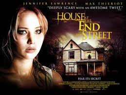
The left hand side of the poster features Jennifer Lawrence face poising a scared expression. Her face is highlighted with a higher saturation and brightness making her stand out in contrast to the dark black shadowy background. Also typical connotations of her white pale facial tone associate fear, fright and desolation with her features.
Also, the dark black makeup around her eyes make them stand out on the poster and as many critics have argued 'eyes are the window to a person/actors emotions' this gives away hints about our protagonist and the fear she may encounter during the movie. The fact that Jennifer Lawrence has such prevalence on this poster is interesting because typical conventions of horror movies dont feature main actors just eerie situations or gruesome or obscure objects or scenes or even the monster or ghoul in the horror rather than the main character however here because of Lawrences prior fame from being in the hunger games trilogy she will act as a unique selling point for audiences wanting to see the film. The direct audience address from Jennifer Lawerence draws audiences in by making them feel targeted and directed at by the poster. Especially in horror movies direct mode of address is a typical and stylistic trait in making audiences reciprocate the fear that the main character is feeling. Audiences will have known of Lawerence as an actor before her role in this movie after the hunger games box office success so they would recognize her as a heroic protagonist so possibly already be able to associate themselves with Lawrences character in this movie creating a connection and urge to see the movie,
The dark shadowy figure depicted in the window of the house creates a sense of fear and an enigma to the movie as audiences would want to find out who/what this shadow is. Typically of horror movies they create a sense of awaiting and build up of tension before revealing what is lurking in the shadows. The subject pronoun usage of 'its' (fear its secret) used underneath the shadow of the 'thing' in the window creates a impersonal connection with whatever may be in the shadows as its being objectified and impersonalised rather than being referred to as a being. 'its' could also however be referring to the house which is a typical convention of horror movies having a haunted house. The lexical word choices of 'secret' 'deeply' and 'twist' in some of the posters captions link to the semantic field of secrecy and freight,
The color choice of yellow on the black background stands out as black and yellow together are used as warning colors, in the real world on warning tape. Also having yellow for the text instead of cliche horror movie titling colors such as black and red makes this movie stand out- and as i remember seeing it for the first time on the side of a telephone box- draws audiences in to read the title.
The quote from a magazine on the poster helps with the films publicity as well as making it seem more authoritative and credible. The two contrasting word choices of the adjectives 'scary' and 'awesome' hint a sub genre for the film of a thriller or action plot alongside its themes of horror.
No comments:
Post a Comment