
ROBYN PRODUCTIONS;
 in our AS media film opening creation we used the proper noun 'ROBYN' as the title for our production, which we found was effective as the name itself appears to have juxtaposing un coordinating letters with the names Germanic ancestry and historical roots, meaning something bright and shining which directly contrasts and juxtaposes with our dark themes and imagery and the dark background the title always overlays. This name being used as a title for our past production meant it had close personal links, and was something that could connect our media portfolio over the two years, and so we felt maintaining this name as a institution title created almost a brand identity for our productions....a name that would be recognized and renown. Using ROBYN as an institution title was also effective as it allowed us to asses its effectiveness and overall impact in comparison to using it as a film title as we did for AS. this meant we could delve deeper into analysis for our institutional research.
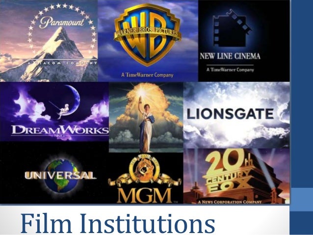
The font for our institution with a scribbled childish structure subverted away from bold computer generated generic institution fonts such as Warner brothers or lions gate making it stand out and diverge from cliched and generic institution conventions. this also perhaps reinforces the small scale institutions and independent companies we idealize that our film would be produced by on its low budget development. The 'productions' part of the institutional title adopts a similar font to that of american horror story, a popular culture televised TV series, and hence audiences would recognize and relate to this.
The name Robyn appears on our film poster as well as in the trailers beginning creating a brand identity for the production making it seem professional and giving audiences a institution to associate with and recognize across the production and ancillary texts
DIM LIGHT FILMS
this institution appears before our trailer commences with a moving graphic image of a candle burning to give the institutions title appearance a more memorable and stand out appearance rater than our title appearing simply over a still image or original photograph which would have been unconventional as institution titles before films tend to move, glare, spin or slightly change such as dream works for example where the clouds part, or MGM where the lion roars and hence we wanted our institution title to adhere to this.
The quick onscreen presence of this title doesn't bore audiences by taking up large proportions of the trailers duration which would be deemed uninteresting. As well as this The candle being blown out behind the institution title is associated with horror and the unknown as audiences are thrown into darkness, which then leads to relational editing leading into the dark opening scene of our trailer. It makes our institution a specialist institution for horror movie production much like twisted pictures and blumhouse pictures which are most frequently institutions for the creation of horror movies, this hence creates a brand for us of a horror movie producer. The title of the institution 'dimlight' connotes something dark and mysterious. it is a noun that directly links with the lack of lighting in our trailer which makes it relative and current.
No comments:
Post a Comment